Color contrast in the real world: strategies for accessible text with complex backgrounds

Several weeks ago, I wrote about how to choose accessible color combinations for text and backgrounds. However, sometimes navigating color contrast involves more than just two colors. Gradients, patterns, text decorations, images, and more can impact the readability of text.

I want to build upon my previous article on color contrast to address common situations that may require a little extra consideration to ensure adequate contrast between text and backgrounds. To do this, I’ll use an example from a forum that most people are familiar with — social media posts.

Busy backgrounds and tricky text

Many social media platforms provide the ability to choose predefined background for shorter posts Here is a screenshot of a Facebook post I created using one such background. Unfortunately, this feature made it really easy to create a thoroughly inaccessible post.
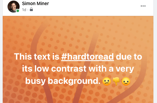
A Facebook post with white text atop a light and patterned background of gradient orange

There are several color contrast issues here

  • The white text is difficult to read against the light orange background, particularly in the first line where the gradient is lightest. The orange hue shifts from darker to lighter orange traveling diagonally from the bottom-left to top-right of the post. Although the start of the final line of text adequately contrasts with its background color, the difference between the word “to” at the end of the first line and its orange backdrop is too slight. Its color contrast is significantly less than the minimum required contrast ratio for larger font sizes.

  • The background pattern makes it challenging to parse the words in the message. I find that the darker orange spots and lines behind the text require me to focus on each letter to identify it, which drastically slows down my reading and comprehension. I imagine that other people with, and maybe without, vision disabilities also experience this obstacle.

  • The #hardtoread hashtag is underlined. This indicates that it’s a link, which in theory is good. However, in the context of this post, the extra line beneath the tag adds more clutter to the mix, making the hashtag harder to read and interact with. It’s also confusing, as we typically do not encounter or expect hyperlinks atop decorative backgrounds.

  • The emojis at the end of the message are mostly yellow and orange, which makes them particularly challenging to recognize against such a similar background color. I need to concentrate pretty hard to make out the thumbs-down icon, and I already know it’s there.

There are a number of color contrast guidelines we can infer from the accessibility barriers in this example post.

  • Choose clean and uncluttered backgrounds for your text.

  • If you want to use a background with a color gradient, be certain that all its colors contrast adequately with the text in front of them.

  • Avoid background patterns underneath the text as they can make the message harder to read. Stick to patterns that are confined to the post’s margins and don’t collide with the text.

  • Watch out for emojis in posts with backgrounds. Chances are that an emoji will be a different color than the message text, so you’ll need to make certain it too contrasts adequately with the background color

  • Shy away from links in posts with custom backgrounds, as their purpose is unclear. Their underlines and special characters are more likely to clutter and confuse than encourage users to click.

Below is another Facebook post with a different predefined background. This one observes the above guidelines and avoids the barriers of the previous example. After viewing the post on both my laptop and phone, I needed to manually reposition some words on different lines with newline characters (using the Enter key) to make them flow properly, but this minor effort makes the post much more accessible.

A Facebook post with a high contrast between its text and background, whose nature-themed image elements are entirely in the margins around the post message

Beyond social media

The accessible color principles outlined in this article apply to much more than social media posts. They are relevant to any sort of digital or print media that incorporates backgrounds and other non-text elements — slide decks, reports, websites, brochures, flyers, posters, and the list goes on.

Here are a few more general principles to help you ensure good color contrast in your documents.

  • Good text and background color contrast is especially important for presentations created with programs like Microsoft PowerPoint, Google Slides, or Apple Keynote. During a presentation, people will likely be viewing the slides from greater distances than the space between their eyes and phone or computer monitor.

  • Ink-based colors on the printed page are different from their light-based counterparts on a screen. Before making dozens of hard copies, print a single copy to check that the text and background colors in the document have adequate contrast on paper. This will be more subjective than measuring color contrast in a digital environment, but it’s still a vital step to keep your content accessible in the physical world.

  • Be mindful of individuals with colorblindness when choosing colors. Certain combinations of colors like red and green are difficult or impossible for some people to distinguish. It’s a good idea to test your documents with a color blindness simulator to get an idea of how others might perceive your work.

  • Consider the possible contexts in which people will engage with your work. Lighting conditions will probably not always be optimal. For instance, if a reader is outside squinting at their phones in the bright sun, good color contrast will likely be a determining factor in whether they read your content or skip over it.

With tools like Color Safe, picking an accessible background color for text is straightforward, but the art of good color contrast is much more nuanced. Using the techniques in this post will help ensure that your text and background elements stand out from each other, are perceptible to your readers, and steer clear of the most common web accessibility barrier.

Update:Danielle Zacaro shared a link to a text on background image a11y check tool that validates color contrast for an image, string of text, and background color you speciy.

More WebAIM Million articles

The text "WebAIM Million 2024 vs 2025" hovers above an arrow gently sloping downward from left to right The WebAIM Million: What Changed from 2024 to 2025? The web is slowly getting more accessible—but not fast enough. Each year, WebAIM scans one million home pages for accessibility issues. I’ve pulled the biggest insights from the 2024 and 2025 reports so you can see what’s improving, what’s not, and what it means for your website.

The word 'lost' in dark lettering fading away into an eerie greenish fog Color contrast in the real world: strategies for accessible text with complex backgrounds Picking an accessible background color for text is straightforward, but the art of good color contrast gets more nuanced for backdrops with multiple colors and other visual effects. Here's how to ensure your text and background elements stand out from each other and avoid the most common web accessibility barrier.

A brightly-colored blue bird on a tree branch stands in stark contrast to a background divided vertically into swaths of solid blue and black. The text 'the importance of high color contrast' is written above the bird in almost the same hue as the blue background, making the portion of the statement atop the light blue background very difficult to read. A non-techie’s guide to choosing accessible color combinations Insufficient contrast between text and background colors is the most common accessibility issue on the web. However, choosing accessible color combinations doesn't have to be difficult. Here's a step-by-step process for doing so that requires zero technical knowledge.


Share This

Get a taste of how blind people experience the web with Site Unseen

Site Unseen is a Chrome extension I created to help you appreciate how blind people use the web. When activated, this tool obscures the current page and provides a screen reader emulator that you can use to explore its contents. This browser extension enables you to foster empathy in yourself and your community for those with vision disabilities, build the case for accessible web design, and test for web accessibility issues.

Getting Site Unseen

Site Unseen is available in the Chrome Web Store. To install it, all you need to do is press the “Add to Chrome” button on the paged linked at the beginning of this paragraph.

Activating Site Unseen

Once installed, the Site Unseen icon, a miniature version of the picture of a blue stick figure with a cane walking in front of a globe at the start of this article, should appear in your browser’s toolbar. Navigate to a page like this one outside of the Chrome Web Store. (Most Chrome extensions won’t work there.)

Press the Site Unseen icon. The icon should turn green, and the web page should be obscured by an opaque black overlay with a box outlined at the bottom right of the screen. This initially contains the title of the current web page, if there is one. (Note that the contents of the web page are still present; they are just hidden behind the overlay.)

Annotated screenshot of the Site Unseen Chrome browser extensions with labels and explanations for the extension icon, Peek and Help buttons, and text box

Using Site Unseen

There are two blue buttons at the top right of the screen when Site Unseen is active.

  • Press the “Peek” button or the asterisk key (*) to temporarily reveal the contents of the page.
  • Press the “Help” button or the question mark key (?) to display a dialog box that lists and describes the keyboard commands supported by Site Unseen. These commands are also enumerated on the Site Unseen website.

Normal browser keyboard shortcuts to navigate and interact with page elements should continue to work as they typically do.

  • The Tab and Shift+Tab keys move current focus to the next and previous interactive elements, such as links, buttons, and form fields.
  • The Enter key activates the current element, performing actions like following a link or pressing a button).
  • The Up and Down arrow keys move between form field options in a popup menu, set of checkboxes, or radio button group.
  • The Space key selects the menu option, checkbox, or radio button currently in focus.

Site Unseen emulates a screen reader by allowing you to move through the page contents using the Left and Right arrow keys to go to the next or previous element, respectively. These arrow keys navigate through both interactive and non-interactive elements on the page.

As you move between different page elements, the text in the box outlined at the bottom right of the screen should update to show the type and contents of the current element. For instance, if the box contains the text “heading level 1: Support” it means that you are currently focused on the page’s main heading element whose text is “Support”.

Certain keys allow you to jump to the next or previous instance of specific types of element. For instance, pressing h takes you to the first/next heading, and pressing H moves you to the previous heading.

Deactivating Site Unseen

To turn off Site Unseen, press the Site Unseen icon in your browser toolbar so that it changes from green back to blue. This should remove the black overlay and its elements, revealing the page contents again.

Alternatively, you can reload the web page to disable Site Unseen.


I hope you’ll give Site Unseen a try and let me know what you think. Please contact me or leave a comment on this article if you have any thoughts or suggestions, or if you encounter a problem with the extension.

Share This

4 approaches to advocating for accessibility and how they fit together

There are several standpoints from which to make the case for accessibility. Given different circumstances, some of these approaches might be more effective than others. However, all of them have their time and place depending on the situation and audience.

I didn’t always believe this. Earlier in my career, I was convinced that some approaches to accessibility advocacy were unquestionably better than others.

The spectrum of advocacy

My initial take was that accessibility advocacy approaches fell along a spectrum between the poles of altruism and self-centeredness. The four approaches on the spectrum and some supporting arguments for each are outlined here, taking inspiration from Onward Search’s guide Making the Case for Digital Accessibility.

A color ribbon of purple, blue, green, and red wit titled 'Accessibility Advocacy Spectrum' and labeled 'Altruistic' and 'Self-serving' at either end holds up four columns of text describing different approaches to accessibility advocacy. Moral/ethical: Creating accessible digital experiences is the right thing to do. User experience: Accessible digital experiences are better for everyone. Business: Accessible digital experiences increase brand reputation, market share, and revenue. Legal: Accessible digital experiences comply with laws and reduce the risk of litigation.

The moral/ethical approach

25% of Americans and 1.3 billion people worldwide live with significant disability. This is a huge demographic, and it’s getting larger as the population ages. Everyone experiences disability as we get older, so creating accessible digital experiences is the right thing to do for all of us.

The user experience argument

Accessible digital experiences are more usable for everybody. Several principles of good mobile design closely align with accessibility concerns. An accessible interface is more flexible than an inaccessible one, allowing abled and disabled users alike to choose how they interact with it in the way that suits them best.

The business case for accessibility

A recent study found that the disability community represents $8 trillion in annual disposable income, so there is real profit to be made from accessible digital experiences. Offering accessible products and services builds a brand’s reputation and market share among people with disabilities. Search engines reward accessible websites with more prominent search results listings and penalize inaccessible ones with lower rankings.

Legal stipulations for accessibility

In 2023, more than 4500 digital accessibility lawsuits were filed. The legal responsibilities and consequences of digital accessibility are real, and they are becoming more stringent and widely enforced. For instance, the Department of Justice recently published its final rule on the ADA which stipulates that all state and local government websites and mobile apps need to comply with the WCAG within the next two to three years. The European Accessibility Act (EAA) requires any company doing business in the EU to ensure that its digital products and services are accessible. This law goes into full effect in June 2025 and will carry steep fines and even potential jail time for businesses that don’t comply with it.


I concluded that the most noble reason to make websites and digital products accessible was simply because it’s the right thing to do for people with disabilities. Creating a good user experience that everyone can use was also a good impetus.

However, advocating for accessibility to improve a business’s reputation or revenue, and especially by threatening lawsuits and other legal consequences struck me as appeals to greed and outright fear-mongering. In my mind, these last two approaches were to be avoided or considered only as a last resort. Organizations shouldn’t need these baser appeals to invest in digital accessibility.

An unexpected call to change my thinking

One day I received an unsolicited email from a sales representative at an accessibility overlay company. The email contained a screenshot of the homepage of a firm whose website I was doing accessibility work on. The image was annotated to show an accessibility issue on the page, which the email said the overlay company would be glad to help address to mitigate risk of a lawsuit.

I was frustrated by this fear-based tactic. Trying to scare an organization into purchasing an accessibility “solution” is pretty low, even for an overlay vendor. In response, I went to the overlay company’s homepage, found an accessibility defect there, took a screenshot, and annotated it to describe the problem. I then hit “Reply” to the sales rep’s message and attached the screenshot. I wrote that as a digital accessibility professional, I would be happy to work with their company to remove accessibility barriers like this one from their website and discuss more effective ways to foster digital inclusiveness.

Unsurprisingly, the sales rep got in touch with me right away, and we had an animated discussion about sales techniques and how overlays do not mitigate legal risk. I asked the rep why they didn’t use more above-board approaches like the moral, user interface, and business cases for accessibility to sell their services. The rep replied that these techniques were far less effective than approaching accessibility from the legal perspective. In short, the stick worked better than the carrot for them to sell their solution.

At the end of our conversation, neither of our minds had changed, and the rep and I agreed to disagree. Yet this discussion caused me to start thinking about whether the legal approach to accessibility advocacy was as undesirable as I made it out to be. Yes, I would much rather use nobler arguments to convince people to invest in digital accessibility, but I had also seen organizations make significant changes to their websites after receiving a demand letter. Accessibility laws are there for a reason, and if other factors don’t motivate organizations to remove accessibility barriers, perhaps the legal perspective might be useful, though not as an agent of fear or intimidation. If a company knows the legal risk and still doesn’t prioritize accessibility, that’s their decision to make, and their consequences to assume.

In the end, I decided to trade up my accessibility advocacy spectrum for something more nuanced.

Overlapping and connected approaches

The accessibility advocacy spectrum implies that only one approach can be used at a time in any situation. This is not the case. As the hero image at the beginning of this article illustrates, effective accessibility advocacy lies where the various approaches overlap. Using multiple perspectives to make the case for accessibility can have a cumulative effect that isn’t there when just “banging the drum” of a single argument. If one line of reasoning doesn’t resonate with a stakeholder, another might. Combining several approaches (even the legal case), creates a stronger overall argument for investing in accessibility.

In addition, the different advocacy approaches outlined in this post complement and connect with each other. This further fortifies the foundational assertion that digital accessibility is an essential and worthwhile investment.

Specific connections between each pair of advocacy approaches are enumerated in the following diagram and table.

Four circles labeled 'Moral/ethical,' 'User experience,' 'Business,' and 'Legal' are connected by arrows with labels that describe their relationships to one another

Connections between accessibility advocacy approaches

Approach 1 Approach 2 Connection Description
Moral / Ethical User Experience Engagement When inclusive user experiences satisfy the moral imperative for accessibility, it fosters engagement from people with disabilities.
User Experience Business Conversion When businesses implement accessible experiences, they build intense brand loyalty with their disabled users leading to increased conversions.
Business Legal Compliance The legal mandate for accessibility necessitates business compliance with digital accessibility laws.
Legal Moral / Ethical  Enforcement  Enforcement of legal accessibility imperatives fulfills the moral and ethical obligation of inclusion.
Moral / Ethical Business Reputation Businesses that take initiative to meet the moral responsibility of accessibility gain a good reputation with the disability community for inclusive products and services.
User Experience Legal Standards Accessibility laws are based on standards such as the WCAG that define elements of accessible user interfaces.

Conclusion

I still don’t believe that leading with the legal argument for accessibility is the best approach. It is confrontational and I think it fosters an unnecessarily adversarial tone in conversations with potential clients. Even so, I’m realizing that the legal perspective is still valid and has its rightful place in the advocacy tool belt. The connections between advocacy approaches strengthen the overall case for accessibility, making each approach more convincing than if it was presented on its own.

Share This

Against Technoableism, or why tech can’t fix my disability

Dr. Ashley Shew’s book Against Technoableism: Rethinking Who Needs Improvement is a collection of witty and eye-opening essays exploring the intricate relationship between disability and technology. On the surface, it may seem like advances in technology vastly improve the lives of individuals with disabilities. While there is truth to this, the picture painted by the media typically tells only one side of the story. Throughout this book, Shew deftly argues that the deeper reality is more complicated and sinister.

The technoableist agenda

“It should go without saying that we need to center disabled people as experts about disability and technology,” asserts Shew. “Yet if we do, we really trouble some underlying assumptions of the ableist world we’re in.” Ableism is any bias or stigma held against disability or disabled people, and it is rampant throughout our society and history.

The hero of the traditional American story has always been a determined self-made white man standing erect with influence, prosperity, and progress. There are so many problems with this caricature, and the one in focus here is that it cannot tolerate anything it sees as different, weak, or dependent. Disability has all of these characteristics, and so it must be ignored, eliminated, or rehabilitated. The American hero sees technology as a means to redeem disabled people so they can be “normal” contributors to society. In this view, technology is a way to overcome disability and free its victims from their infirmities.

From this myopic perspective, disabled people are categorized as pitiable freaks, moochers, shameful sinners, bitter cripples, or inspirational overcomers. They are pressured to make themselves palatable and “include-able” in mainstream society. The media portrays technology as the ultimate solution to the problem of disability. Yet its stories, which are almost always told by non-disabled people, are more often about technological progress than disability. There is a huge difference between what is touted as “liberating technology and actual user experiences,” writes Shew.

The disabled truth

The lived reality of disability with tech is messy. Technology is not a savior. It takes time to adapt and adjust prostheses, hearing aids, eyeglasses, and other assistive tools to the particular circumstances of people’s lives. Tech is expensive and not universally available. It breaks, and sometimes people with disabilities just don’t want to use it.

Shew, who is a leg amputee, uses a prosthetic leg, crutches, and a rolling walker to get around, depending on her energy level and mobility needs. Despite these choices, she laments that the social pressure to walk “is no joke, so deeply embedded are the notions of fitness and vigor to being a good person and citizen.” Walking is society’s ultimate goal for amputees, and advanced prosthetic legs and feet are the obvious way to get there. When Shew and her peers with limb differences opt for something else, even for just a little while, they feel judged for resisting the miracle of technology. Yet they aren’t rejecting tech; they are simply keeping it in its proper place so they can be their authentic disabled selves.

I have Nystagmus, which causes my eyes to make repetitive uncontrolled movements that make it hard for them to focus at a single point for very long. Glasses, which typically have a central focus point, have proven unhelpful to me because I need to move my head around to adjust my bouncing gaze to march the angle and direction the lenses are designed for. This is exhausting and untenable. (I’m getting a headache just thinking about it now.)

Yet so many times people ask me if I’ve tried corrective lenses to alleviate this condition. (See the ableist language there?) I know they mean well, but is it realistic to think that after living with Nystagmus for my entire life that I would have never considered ways to get around this annoying and disruptive aspect of my vision? The technology available just doesn’t work for me. If and when it does, I will be happy to put it to good use, but as far as I know, that day hasn’t come yet. (I would love to chat if you are aware of advances in vision technology which address Nystagmus or its symptoms. Please get in touch with me if you have thoughts about this.)

The future is disabled

Techno-optimism would have us believe that the future will be disability-free, but the exact opposite is true. Every one of us is “temporarily abled” and headed for disability as our bodies age. The whole world is becoming more disabled with climate change, mutating viruses, and other factors rendering our environment less hospitable to our bodies.

I see this first-hand with the rise in mental health issues, delayed social development, and signs of addictive pathways that have come with the overuse of smartphones among children and adolescents. The very technology meant to keep us connected and productive is having the opposite effect on our kids. In response to this, my son’s school is rolling out a cellphone ban for the coming academic year to curb the negative impact the devices have on academics, student behavior and school culture.

I think this is a helpful step toward more effective public school education. However, it’s only a tiny drop in the ocean of tech dependency in our world. After graduation, my son will need to develop and live by his own system if he wants to moderate his screen time. This is no small challenge in a society so saturated by technology that members who cannot use it or don’t want to are excluded by default.

The tools we build shape us so that it’s very hard for us to function without them. We create them to improve our lives, and they often do. Yet as we become over-reliant on them, their benefits mingle with disability, either directly or indirectly. Every widely used technology — smartphones, computers, cars, mass-production, industrial agriculture — comes with its own list of physical and mental impairments that result from its excessive use. Even so, we engineer our civilization to at least prefer and at most require the adoption of these advances.

The futurists aren’t seeing the whole picture through their rose-colored glasses. Technological progress is disabling our planet and its inhabitants at least as much as it is solving its problems. As a result, disability will become more, not less, ubiquitous and pronounced as the years roll on.

Conclusion

“Ableism is the sauce we all marinade in,” quips Shew. This is true for everyone, even people with disabilities. I’m a blind guy, and I still often need to challenge the awkwardness and discomfort I feel when I’m with other people with visual impairments. After all, I’ve worked really hard to fit in and thrive in the “normal” sighted world. (Whoops, there it is again.) I strive to counteract my own bias and hypocrisy with increasing self-awareness and empathy, along with a healthy skepticism of my own limited perspective. It’s a lifetime journey, and one everybody should embark upon.

Tech is my livelihood, and I am certainly not against technology. I just want us to be wary of the simplistic and harmful idea that tech is the perfecter of the human condition. Technology is very useful. It’s also infatuated with itself, often at the expense of the people it should be serving.

Question: Have you ever felt excluded by a technology? How did that make you feel, and how did you respond in that situation?

Share This

A non-techie’s guide to choosing accessible color combinations

81% of homepages tested in the 2024 WebAIM Million report have at least one instance of low contrast text. In digital accessibility, color contrast, also known as relative luminance, is a measurement of the difference in brightness between two adjacent or overlaid colors. Insufficient color contrast between text and background colors is the most common accessibility issue on the web.

Web designers use several methods to specify the exact colors we see on our screens. One of these is hexadecimal color codes). A "hex code" is a string of 6 numbers between 0 and 15, where the letters "A" through "F" represent 10 to 15, to communicate the amount of red, green, and blue (RGB) in a particular color. The contrast between two colors can be calculated with a mathematical formula that yields something called a contrast ratio. Web standards set forth minimum contrast ratios that two colors positioned next to or on top of each other (like text on background) must meet to be considered accessible.

While nerds like me may enjoy diving into the intricacies of color science and its application to web accessibility, many people find this convoluted or just have better things to do. If that’s you, I have good news. You don’t need to understand any of this to choose colors with good contrast. In this post, I’ll show you a quick and easy way to create accessible sets of colors without requiring any technical knowledge.

Why is color contrast important?

Before looking at how to pick accessible color combinations, it’s helpful to understand the wide range of people who benefit from them.

  • People with visual impairments: Individuals with various types of visual impairments, such as low vision and color blindness often struggle to distinguish text from its background if the contrast is too low. High contrast makes text more readable.

  • Older adults: As people age, their vision tends to deteriorate. Older adults may find it difficult to read low-contrast text. Good contrast can help mitigate the effects of aging eyes.

  • People with cognitive disabilities: Clear and distinct text can help users with dyslexia, ADHD, autism, and other cognitive disabilities better understand content. Reduced visual confusion aids in comprehension and navigation.

  • People using mobile devices: In bright light conditions, such as sunlight, low-contrast text can be hard to read, especially on screens. High contrast improves readability when we encounter these situational disabilities/

Good color contrast is good for everyone. Accessible color palettes enhance the readability and usability of websites for all users, making content easier to read and navigate, and improving the overall user experience.

Use this website to pick a pair of accessible colors

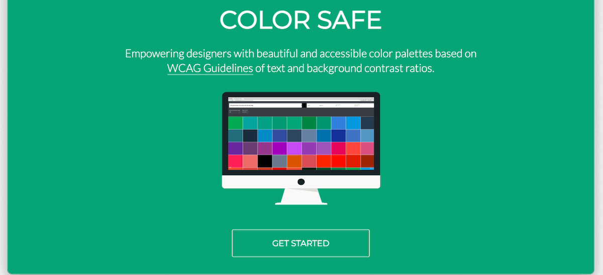
  1. Head over to the Color Safe website created by Donielle Berg and Adrian Rapp and press the Get Started button.

    The Color Safe website homepage. Text above a computer monitor showing a patchwork of colors reads 'Empowering designers with beautiful and accessible color palettes based on WCAG Guidelines of text and background contrast ratios.' A button beneath the monitor is labeled 'Get Started.'

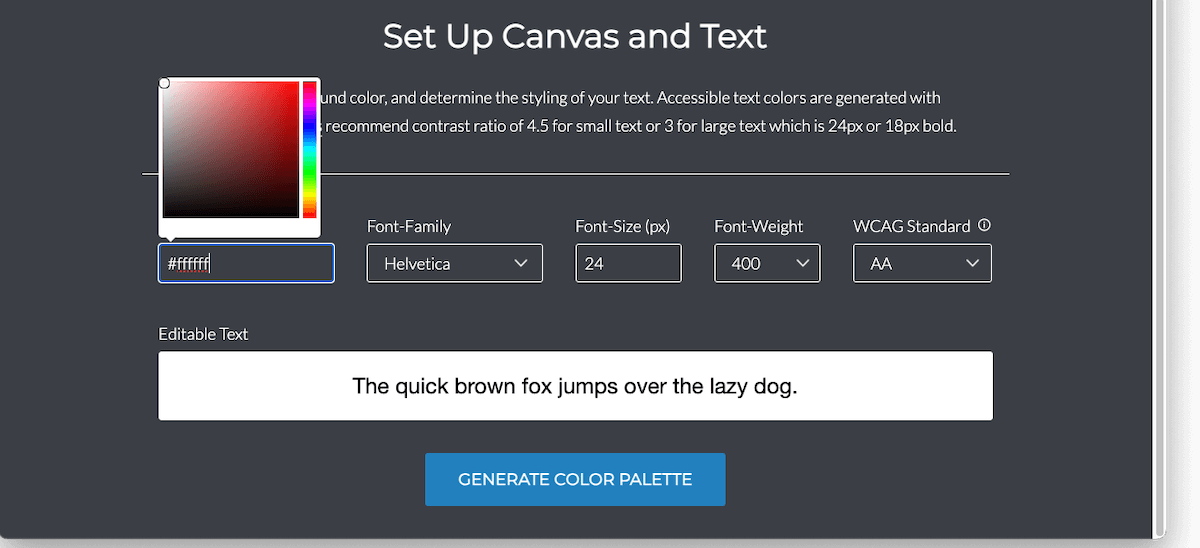
  2. The page should scroll to a form with fields with labels like Background Color, Font-Family, and Font-Size. You’ll notice that the Background Color field is prefilled with the value #ffffff — this is the hexadecimal code for white. When you click your mouse on or tap on this field, a color picker widget like the one pictured below should appear.

    A form entitled 'Set Up Canvas and Text' with fields to specify the background color and font details. A color picker widget hovers above the background color field.  No color has been chosen yet, and the default hex code for white appears in the background color textbox. Sample text against a white background id displayed beneath the form.

  3. Press a point on the vertical spectrum on the right side of the color picker widget to select a general color like red, yellow, or blue. Once you choose a general color, the smooth square palette on the left will update to display a two-dimensional gradient of variations for that color. Clicking or tapping points in this space will change the hex code in the Background Color field to match the selected color. Doing this will also switch the background color of the Editable Text field to your chosen color.

  4. Once you find a background color you like, make note of its hex code in the Background Color field, including the leading # character.

  5. Optionally, modify the values of the Font-Family, Font-Size, and Font-Weight fields. You don’t need to worry about the value in the WCAG Standard field right now.

  6. Press the Generate Color Palette button at the bottom of the form.

    The 'Set Up Canvas and Text' form' with a specific variation of blue selected in the color picker widget. The hex code for the blue appears in the background color textbox, and the sample text sits atop a background of the same shade of blue.

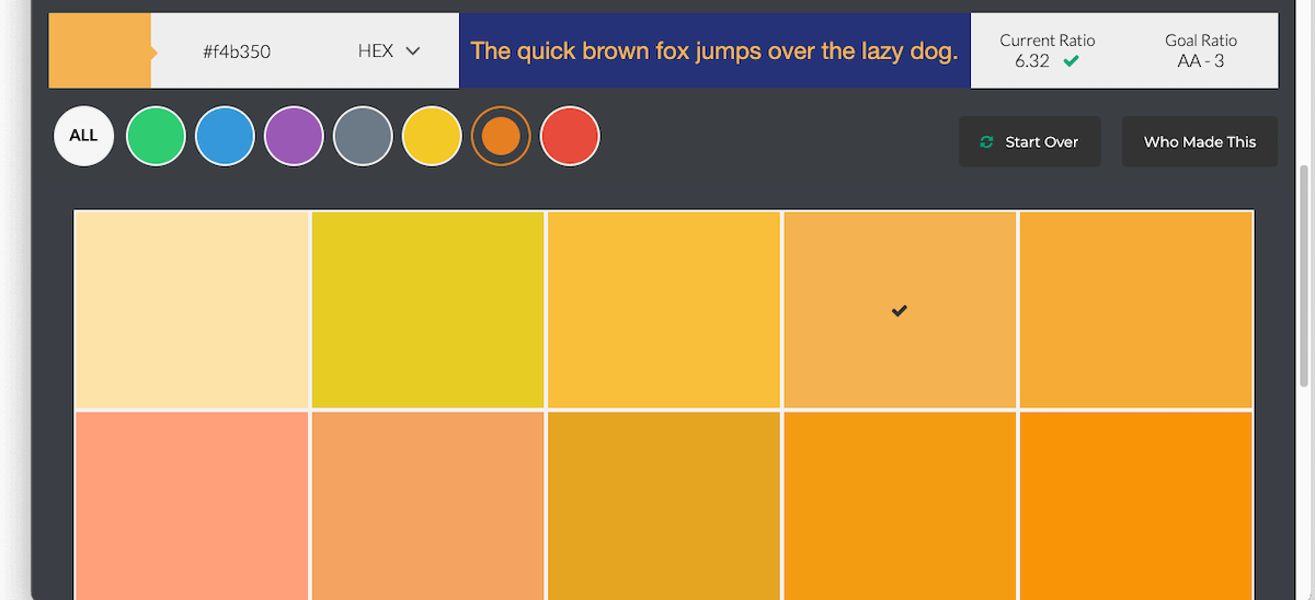
  7. The page should scroll again to reveal a swatch of accessible text colors for your chosen background color. You can filter these by the general colors displayed at the top left.

  8. Click or tap a color in the swatch to display its hex code in the field above the color filters. The editable text field at the top center of the page also updates to show a preview of text with this color atop the background color you picked in the previous step.

  9. Click or tap the text color hex code to copy it to your clipboard. Paste this value in the same location as your background color.

    A swatch of orange hues that will serve as accessible text colors against the blue background. One of the oranges is selected and its hex code appears at the start of the screen with other details and controls

A few notes on the Color Safe tool:

  • The Font-Size influences the number of potential text colors available. In particular, values smaller than 18 will yield fewer choices. This is because larger fonts are easier to read and can still be accessible when there is lower contrast between their text and background.

  • The WCAG Standard field allows you to toggle between levels AA and AAA. AAA is stricter and requires more contrast, so choosing this level will produce fewer text color options. In most cases, level AA color contrast is sufficient. However, government agencies and organizations expressly serving people with visual impairments or other disabilities may need to meet AAA contrast levels.

  • You can see the current and goal color contrast ratios at the top right of the color swatch screen. The goal ratio is determined by the values you choose for the Font-Size and WCAG Standard.

What to do next

Once you have a pair of accessible text and background colors, it’s time to apply them to your content.

  • If you have a designer or developer working on your website, you can give them the text and background color hex codes to use in their designs, pages, and web applications.

  • Most modern website building software like WordPress and Wix offer the ability to customize text and background colors within their theme or page configuration settings. If you run your website yourself, consult your software documentation or do a Google search to find details on how to customize text and background colors.

  • Accessible text and background colors aren’t just for web pages. Any electronic document that contains text should use good color contrast. Most office software suites including Microsoft and Google provide the ability to set text and background colors.

Choosing accessible combinations for text and background colors doesn’t have to be difficult. Using the Color Safe website and the process outlined above, you can select colors with good contrast and make your content more inclusive to everyone.

More WebAIM Million articles

The text "WebAIM Million 2024 vs 2025" hovers above an arrow gently sloping downward from left to right The WebAIM Million: What Changed from 2024 to 2025? The web is slowly getting more accessible—but not fast enough. Each year, WebAIM scans one million home pages for accessibility issues. I’ve pulled the biggest insights from the 2024 and 2025 reports so you can see what’s improving, what’s not, and what it means for your website.
The word 'lost' in dark lettering fading away into an eerie greenish fog Color contrast in the real world: strategies for accessible text with complex backgrounds Picking an accessible background color for text is straightforward, but the art of good color contrast gets more nuanced for backdrops with multiple colors and other visual effects. Here's how to ensure your text and background elements stand out from each other and avoid the most common web accessibility barrier.
A brightly-colored blue bird on a tree branch stands in stark contrast to a background divided vertically into swaths of solid blue and black. The text 'the importance of high color contrast' is written above the bird in almost the same hue as the blue background, making the portion of the statement atop the light blue background very difficult to read. A non-techie’s guide to choosing accessible color combinations Insufficient contrast between text and background colors is the most common accessibility issue on the web. However, choosing accessible color combinations doesn't have to be difficult. Here's a step-by-step process for doing so that requires zero technical knowledge.
Share This

How a trip to the Colorado mountains taught me about dynamic disability

Last month, my family traveled to the high country of Colorado. As we stepped off the plane and made our way through the airport, I started noticing the effects of the thinner air of the Mile High City of Denver on my body. I felt a bit light-headed and more easily winded as we walked toward the rental car pickup area. I had anticipated these challenges while acclimating to the altitude, but there was something else I didn’t expect.

I had to work harder to see.

This was alarming. I needed to concentrate more to read street signs and shop names. Noticing and navigating stairs, rises, and dips in front of me as I walked required additional focus. Objects in the distance were more difficult to make out. This was irritating as I normally operate on low vision, but it was doubly frustrating because I didn’t understand the cause of the sudden deterioration of my eyesight.

Gradually, I began to recognize a close connection between the physical effects of the thinner air on my body and my decreased visual acuity. Under normal circumstances, I continuously spend a small amount of physical and mental energy to focus my eyes on what I am looking at, reading, or trying to bring into focus. However, during intense physical exercise, I subconsciously “turn down” my eyesight to redirect this energy to my body’s increased demands. Over the first couple days in the high country, I realized that my body’s increased effort to get enough oxygen from the thin Colorado air was causing me to unknowingly reroute my “visual energy” away from my eyes.

My environment had caused a significant change in my visual impairment. This type of fluctuation is not uncommon for people who live with disabilities.

Disability is “zigzaggy” and variable

In my experience, disability is dynamic, changing in severity and impact depending on time, environment, and many other circumstances. Disability is a spectrum, and my position on it is not fixed. Most of the time, I don’t need to use assistive devices or technology to make my way around places I know. I’m familiar with the layout of my home, neighborhood, workplace, and church, and I have enough vision to navigate these locations unaided. However, I didn’t hesitate to unfold and use my white cane as my family moved across the expanse of the Denver airport to board our flight home. Besides helping to compensate for the impact of the thinner air on my vision, the cane alerted people in the bustling crowd around us that I might need a bit more space and time to find my way.

Using my cane in some contexts and not others does not mean my blindness is any more or less valid in certain situations. It is simply an indicator of the dynamic nature of disability.

Dr. Ashley Shew, amputee and author of Against Technoablism, lives with dynamic disability every day. In this clip from her interview on the Factually! with Adam Covnover podcast, she talks about how “a lot of disabilities are “zigzaggy” and variable, and a lot of our representations are really static.

How many spoons do you have today?

Spoon theory is a metaphor that helps describe how much physical or mental energy a person has for daily activities. This shorthand can be useful for people with chronic pain, illness, or disability to estimate and communicate their relative stamina and limitations. Spoon allotments fluctuate from day to day, and “spoonies,” as members of the chronic illness community sometimes affectionately call themselves, need to be careful on how they spend their finite supply of spoons.

“We always count spoons to make sure we don’t go over our ration for the day, because we cannot get anymore.” writes disabled scholar and disability activist Dr. Amy Kenny, author of My Body is Not a Prayer Request. “If we are out of spoons, we crash. There is no silverware drawer for us. We cannot save our spoons for ladle. We cannot borrow from tomorrow’s spoons today.”

“We need to recast our bodies as gardens, and not as machines,” Kenny asserts. Unlike our cars, we cannot take our bodies to the repair shop to replace a worn out or broken part with a brand new one, no matter how much science fiction and modern medicine try to convince us otherwise. Instead, we can do our best to eat well, exercise, and reduce stress to create good conditions for a healthy body. However, just like a well-tended garden, whose ultimate success is dependent upon external factors like temperature, sunlight, and moisture, our bodies are also shaped by aging, illness, the need for sleep, and other elements beyond our control. Spoonies understand that our bodies, like gardens, “change with the seasons and require regular rest to restore the land.”

Situational disability is also dynamic

Regardless of whether you count spoons, we all have not-so-good days when our bodies and minds place more restrictions on us than we would like. WE all experience situational disabilities like fatigue, stress, and distractedness that make everyday activities more challenging. And these situational disabilities also vary depending on context. Trying to read your phone in the direct noonday summer sun on a beach with no shade will likely be different from doing so in the mountain twilight on the Colorado River (where the featured image for this article was captured). Yet both situations probably involve squinting to decipher washed-out text in the glare of the sun. The situational disability is the same; only the conditions are different.

Logan International Airport in Boston is at sea level, and when my family’s return flight from Colorado touched down there, I was relieved to find that I could once again both breathe and see without extra effort. My “normal” vision had returned, and with it, a deepened appreciation for how nuanced and un-static disability is, and will always be, in our ever-changing world.

Share This

Here’s a simple recipe for good image alt text

Each year, WebAIM releases a report on the accessibility of the top 1,000,000 home pages on the web. The 2024 WebAIM One Million Report found that 95.9% of these home pages have accessibility issues that can be automatically detected.

This isn’t great news, but there is a silver lining. Most home page accessibility shortcomings can be classified into a small set of just six problems, each of which you can learn to recognize and fix with a little reading and practice, regardless of your technical ability. This post is the first in a series of articles covering these top WebAIM One Million issues and how to address them.

Missing alternative text for images

Images on web pages mean nothing to people who cannot see them unless those images have associated textual descriptions. This alternative text, or “alt text” for short, is a brief written description of an image that can be parsed by assistive technologies like screen readers and refreshable Braille displays. These tools then communicate the alt text to blind and visually impaired users in a format they can perceive such as spoken word or touch.

While automated tools can tell when alt text is missing from an image, they cannot determine the quality of that text when it is present. I can’t tell you how many times I’ve encountered image descriptions like “picture,” “line graph,” or “a person walking.” Vague placeholder descriptions like these are unhelpful and annoying.

There are numerous services available that use artificial intelligence to generate image descriptions. While text from these solutions can provide a starting point, they still need to be reviewed, enhanced, and corrected by a real person. This is because AI cannot understand context. In another post, I discussed how a picture of a stoplight can have very different meanings depending on the content surrounding it. It might convey one thing in an article about traffic problems but quite another as part of a warning against consuming too much alcohol. Good alt text is an art that requires a human touch.

This article is not a primer on image descriptions. The W3C has a great tutorial on accessible images that you should go through if you are new to the topic. Instead, I want to share a simple strategy that I use to create meaningful and relevant alternative text.

The ingredients for good image descriptions

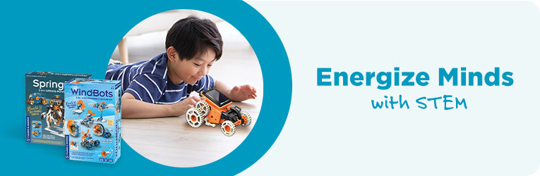
A young Asian boy plays with a vehicle built with a MindBots construction set. Adjacent text reads, 'Energize minds with STEM.;

Good alt text often lives at the intersection of three factors.

Content

What is in the image? What does it depict, and what elements does it contain? What are the defining features and visual characteristics of each item? Image content can include people, other living things, objects, text, color, patterns, and virtually anything else that can be described. While an image may have a main subject or focal point, its content is usually more extensive.

The preceding image shows a young Asian boy in a blue striped shirt lying on the floor and playing with a yellow vehicle built from a MindBots toy construction set. It also contains two boxed MindBots kits and the text “Energize Minds with STEM” with the words “with STEM” printed in handwriting-style font. The picture of the boy is circular and surrounded by a soft blue background which also sits behind the MindBots kits. The text is written in the same blue color.

Although this description is accurate and somewhat comprehensive, it’s very long and does not indicate the relative importance of the various elements in the image. While an image’s content may be a good place to start, it’s generally too broad on its own for alternative text.

Context

What is around the image? What neighboring content does it support and supplement? How does the image fit with its surroundings?

The image at the beginning of this section was copied from a page on an e-commerce website featuring home education products. The page advertises toys, games, and puzzles to help children discover and learn about science, technology, engineering, and math. Each product includes a title, price, description, and “Add to Cart” button.

Taking an image’s content and context together allows us to infer how it is relevant to its setting and which of its features might be most important. These two factors often point directly to the final alt text ingredient.

Purpose

Why is the image present? What does it communicate to the user? How does it contribute to the overall message of its setting?

In the context of a webpage of STEM homeschooling products, the image of the boy playing with the MindBots set is meant to convey a sense of fun engagement. It is there to pique a sense of curiosity and delight in building and learning new things.

Combining the components of content, context, and purpose, and keeping best practices for brevity and composition in mind we might choose alternative text like “A young Asian boy plays with a vehicle built with a MindBots construction set; adjacent text reads, ‘Energize minds with STEM.'” for this image.

Examples

Now let’s practice putting this strategy into action with different kinds of images.

Images with text

In general, images of text should be avoided. If the image really needs to contain text, all of this text must be included in its alternative description.

For the image in the previous section that advertises homeschool STEM products, “Energize minds with STEM” is appropriate (albeit minimal) alt text because it conveys the essential content and purpose of the image and compliments its context on a home education product listing page. However, “”A young Asian boy plays with a vehicle built with a MindBots construction set; adjacent text reads, ‘Energize minds with STEM.'” may be more effective as it provides a fuller description of these factors while still being clear and concise.

Photographs

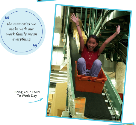
A young black girl sitting in a red tote zooms down a distribution center conveyor belt

Photos typically contain lots of content. This image shows a smiling young black girl with raised arms sitting in a red tote sliding down a conveyor belt in a distribution center. She is wearing a red shirt and jeans. The conveyor belt is black. The image also shows machinery and conveyors carrying boxes in the background. What’s relevant here?

To find out, we need to examine the context surrounding the photo. An excerpt of the web page on which the image resides contains adjacent text that talks about the importance of “work family” and indicates that the picture was taken at an organization’s Bring Your Child to Work Day.

An excerpt from a company's 'Bring Your Child to Work Day' webpage with a fun doctored photo of a young girl in a red tote zooming down a conveyor belt and the text 'the memories we make with our work family mean everything.'

The purpose of the image can be derived from this context. The photo is an example of the fun and memorable times employees and their families experience at Bring Your Child to Work Day. It’s here to elicit laughter, nostalgia, and a feeling of delight.

One important note is that the girl is not actually riding a tote down the conveyor. This would be dangerous and probably not lead to family fun. This picture was actually taken with the girl sitting in the tote in front of a green screen. The conveyor belt and other background was added after-the-fact. This can be inferred from the subtle visual cue that the scale of the girl and tote does not quite match that of the conveyer. This is a helpful detail that should be included in the image alt text.

With these factors in view, a suitable alt text for the photo on its web page might be something like “A doctored photo of a young black girl sitting in a red tote zooms down a distribution center conveyor belt.” There’s no need to mention family fun or Bring Your Child to Work Day in the image description because these details are given in the adjacent text.

Informational or Complex Images

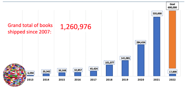
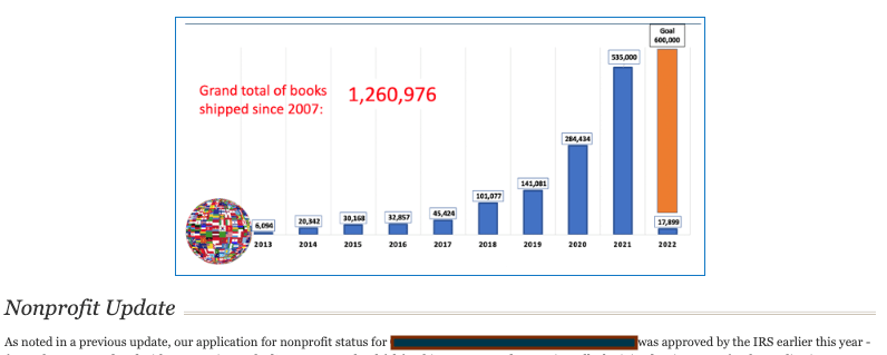
A bar chart showing the increasing number of books shipped year over year with the text 'Grand total of books shipped since 2007 - 1,260,976'

Images that communicate data require special consideration. There is a lot of content in the bar chart depicted here. Besides the text indicating the grand total of books shipped, each bar on the chart has an associated book count and year. Alternative text would not be sufficient to fully describe this image; its data would need to be formatted as nearby text in the document, probably in a table.

However, context again is key. The following image shows the chart in its setting, a newsletter for a nonprofit organization. The text following the bar chart indicates that the organization achieved non-profit status earlier in the year. This and other neighboring content make clear that the newsletter is meant to encourage readers about the progress the nonprofit organization is making.

An excerpt from a charity organization's newsletter with a chart showing the increasing number of books they have shipped each year and a message about their non-profit status being approved by the IRS.

As before, the image’s content and context inform its purpose. The bar chart is present to illustrate the increasing number of books the nonprofit has shipped year over year. The actual numbers are not as important, except for the grand total embedded in the text within the image. Combining these ingredients leads to meaningful alt text like “A bar chart showing the increasing number of books shipped year over year with the text ‘Grand total of books shipped since 2007 – 1,260,976.'”

Conclusion

One way to create effective alternative text for an image is to ask three simple questions.

  • What is in the image? (content)
  • What is around the image? (context)
  • Why is the image present? (purpose)

The point where the answers to these questions overlap will likely inspire a meaningful text description for the image. I have found that taking this description and finessing it to be clear, concise, and uncluttered usually produces high quality alt text.

More WebAIM Million articles

The text "WebAIM Million 2024 vs 2025" hovers above an arrow gently sloping downward from left to right The WebAIM Million: What Changed from 2024 to 2025? The web is slowly getting more accessible—but not fast enough. Each year, WebAIM scans one million home pages for accessibility issues. I’ve pulled the biggest insights from the 2024 and 2025 reports so you can see what’s improving, what’s not, and what it means for your website.
The word 'lost' in dark lettering fading away into an eerie greenish fog Color contrast in the real world: strategies for accessible text with complex backgrounds Picking an accessible background color for text is straightforward, but the art of good color contrast gets more nuanced for backdrops with multiple colors and other visual effects. Here's how to ensure your text and background elements stand out from each other and avoid the most common web accessibility barrier.
A brightly-colored blue bird on a tree branch stands in stark contrast to a background divided vertically into swaths of solid blue and black. The text 'the importance of high color contrast' is written above the bird in almost the same hue as the blue background, making the portion of the statement atop the light blue background very difficult to read. A non-techie’s guide to choosing accessible color combinations Insufficient contrast between text and background colors is the most common accessibility issue on the web. However, choosing accessible color combinations doesn't have to be difficult. Here's a step-by-step process for doing so that requires zero technical knowledge.
Share This

Blind Sight: More on how a blind guy learns to play piano

Several weeks ago, I shared some thoughts on how blind people can learn to play piano without reading sheet music. There are several more techniques that helped me become proficient on the piano as someone with low vision. After some conversations arising from the previous article, I’m posting these here with the hopes that both students and teachers may find them useful.

Putting theory into practice

Memorizing music, playing by ear, and improvising enabled me to learn and play music without being able to sightread it. Putting these methods together worked pretty well for me, and coming out of high school, I had some unrefined ideas in my head about how chords and keys fit together, though I wasn’t able to put them into words very well.

Studying music theory in college supercharged these skills. It was like learning the words to a language I already sort of understood but didn’t know how to articulate. Assigning names and definitions to the rough concepts I had collected revealed how dynamic and interconnected they were.

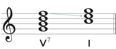
For instance, I already knew that when playing in the key of C major, the notes G, B, D, and F together formed a chord that naturally pulled toward a C chord. My piano teacher had told me this was called a dominant seventh, but that really didn’t mean much to me because I couldn’t see how it impacted the music I wanted to play (mostly video game themes).

In my music theory courses, we analyzed more than just the notes themselves. We looked at how they built upon and interacted with each other in the context of hymns, pop songs, and piano sonatas, extracting patterns that we could hunt for in other pieces of music. As I became comfortable with this intricate backdrop, I realized why a dominant seventh chord worked the way it did. When I saw one, I had a pretty good idea of what chords might have led to it, and which ones would probably follow.

A treble clef staff showing a dominant seventh chord resolving to its tonic in the key of C with the labels V7 and I beneath the chords

On top of this, there was shorthand that encapsulated these complexities. I could write the text "V7" to succinctly capture the essence of a dominant seventh chord with just a Roman numeral and a digit. This was immensely powerful as it worked regardless of whatever key a piece was in. It was also visually accessible to me, as I could read a large print "V7" on the fly in a way I had never been able to do with the corresponding notes on a staff. And even when I couldn’t see the chord symbol, I learned its sonic characteristics and how to anticipate and optimize them in songs, including ones I was hearing or playing for the very first time. This kind of musical understanding and appreciation didn’t need to come through a printed score, and it was wonderfully life-giving.

Making it up as I go

I was very young when I started "formally" composing my own songs. I remember playing one of my earliest pieces entitled "Animals on Parade" at my very first piano recital, the left hand walking a marching bass line with big triumphant chords bouncing along above it. My original songs were constant companions as I learned the piano.

Once I had a solid foundation in musical theory, composition became faster and more fun. I often felt like the right chords would spring into being just in time for an unfolding melody line. I could explore these creations fully in my mind and get audible feedback and reminders by playing them on the piano. I didn’t really need to unpack visual representations, although that could be useful too.

During my college music theory courses, I applied the concepts I was learning to hymn reharmonizations and original songs I played in church services. It was incredibly valuable to put newly encountered musical devices into practice right away, as doing so gave me working examples that I could reuse, experiment with, and improve upon as I wrote new pieces.

Feeling the notes

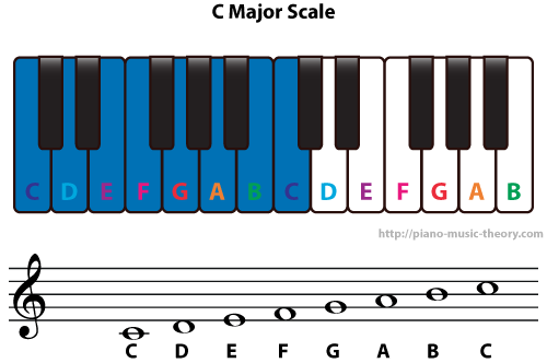
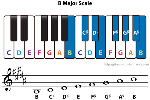
The sense of touch is very instructive when learning the piano. Black keys are arranged in sets of two or three, with each pair or trio separated by a two white notes. This means that each key has a distinctive physical shape to its scale and chords. Playing in the key of C major, which is comprised of all white keys, feels very different to one’s fingers than playing in its immediate neighbor B major, a key that is also rooted on a white note but also includes all the black keys. These variations provide helpful points of reference that facilitate navigating the keyboard without having to look at it.

The C Major scale diagrammed on a piano keyboard with all white notes and appearing on a musical staff The B Major scale diagrammed on a piano keyboard with its white and black notes and appearing on a musical staff

Recently, I was asked to play piano for Andrew Peterson’s beautiful piece "Is He Worthy" for a concert at my church. The song features wide walking broken chords in the left-hand which require most musicians (including me) to lift and shift their palm to span the large intervals between the top and bottom notes. I already knew the piece in its original key of B major, and so I was surprised when I struggled to play it transposed up a half step to C major. The source of my troubles was the different shapes of the large intervals in the left hand. In B major, it’s easy to feel the relative position of the notes in these chords because they include both white and black keys. However, in C major with its scale of identically spaced and shaped white keys, these tactile markers are not present. I needed to concentrate on moving my hand the exact distance between the notes to play the song in this new key, and it took more practice than I anticipated to adjust my muscle memory accordingly.

In addition to the piano itself, there are toys and other tactile piano learning aids available to help students literally get the feel of the keys. After publishing my previous post on this topic, I followed up with the piano teacher who helped inspire these posts. She told me excitedly how one of her blind students was making great progress using a piano puzzle she ordered for him. Touching the notes and assembling them into the shape of a keyboard is giving him a whole new way of learning about the piano.

Conclusion

Effective learning encourages seeking out different ways to experience the material being studied. Multi-sensory perspectives and different mental frameworks can be very helpful to learners with disabilities. Piano lessons are no exception. Sheet music may be one of the primary ways to communicate information, but this in no way prevents blind students for learning with other means like playing by ear, improvisation, understanding the physical layout of the keyboard, and a good working knowledge of musical theory. In my experience, your imagination and creativity are the only limits to your ability to learn to play piano.

More Blind Sight articles

White silhouettes of a man and a woman dance beneath the Disability Pride flag. The man is holding a red-tipped cane in one of his hands. Blind Sight: The Pride Behind the Pride, a Thank-You to Those Who Dance with Us July is Disability Pride Month—a time to honor the experiences, rights, and dignity of people with disabilities. This month, many of us assert our identities, share our stories, and push for change in a world not yet built with us in mind. But today, I want to use this moment to shine a light in a different direction.
Cars zoom through a busy intersection with a brightly painted crosswalk and overhanging set of stoplights Blind Sight: Why did the blind guy cross the road? I am legally blind, and I live near a busy intersection near Boston. I don't typically use a cane to get around familiar places, but this intersection is still challenging when drivers don't observe the walk signals. I wondered if anything might change if I used my cane. Here's what happened.
The hammers beneath an upright piano cover above the instrument's keys Blind Sight: More on how a blind guy learns to play piano Additional thoughts on how blind people can become proficient at playing the piano.

Share This

Your website needs an accessibility statement. Here’s why.

A couple weeks ago, my daytime employer published an accessibility statement to its website. This has been a long time coming, I have been in discussion with company leadership for two and a half years about the purpose, benefits, and legal ramifications associated with an accessibility statement. The statement has room for improvement, but it’s finally live and I am feeling pretty encouraged right now.

In light of this milestone, I would like to write about why your website should also have an accessibility statement.

What is an accessibility statement

An accessibility statement is a document that communicates your organization’s commitment and efforts to make its website, apps, software, and/or other digital assets accessible to users with disabilities. It’s important to understand that an accessibility statement is not so much a guarantee that a website is accessible as it is a public commitment to digital accessibility. Accessibility is an ongoing process. With constant changes in technology and legislation, and each user having distinct needs, the most any organization can really guarantee is that its product was completely accessible at a single point in time and under a well-defined set of circumstances. And even that is very hard to do.

Instead, a good accessibility statement should convey your efforts and intent towards an inclusive digital experience. Gen Herres from Easy A11y Guide recently published a video on how to test a website for an accessibility statement. In it, she outlines the primary information that needs to be in this document. The following list of accessibility statement components is inspired by Gen’s list.

Commitment to digital accessibility

First, articulate the particular accessibility standard your website strives to meet. For instance, many accessibility statements reference the most recent version of the Web Content Accessibility Guidelines (WCAG 2.2 at the time of this writing) level AA as their standard, as it has been successfully argued in many lawsuits to be a good benchmark of an accessible website. Another example is Section 508, which all digital properties managed by United States government agencies are required to comply with.

Communicate your accessibility efforts

Provide a list of specific steps your organization has taken to make its digital resources accessible. This can include items like the following.

  • Digital accessibility best practices your site employs such as support for keyboard navigation, accessible forms, and semantic HTML.
  • Specific standard requirements that are of particular importance to your visitors. For instance, if you run a stock photography website, you may want to explicitly call out that all images have alternative descriptions in accordance with the WCAG 2.2 1.1.1 Non-text Content success criterion.
  • Partnerships with third-party vendors or experts you are engaging with to test and treat your website for accessibility issues.

You should also describe any known accessibility limitations and inaccessible content on your site along with what steps are being taken to improve these shortcomings. In a recent episode of the Accessibility Craft podcast, Equalize Digital CEO Amber Hinds details her efforts to create an accessible WooCommerce site to sell merchandise themed for the podcast. The accessibility statement for this site includes a Work in Progress section which lists accessibility issues with third-party software along with links to Github issues she created for these problems.

Contact information

Let visitors know how they can report an accessibility issue on your site or ask for help. At minimum, you should give an email address visitors can use to contact you. Include a customer service phone number if you have one, and provide links to contact or feedback forms on your website..

Modification clause and last updated date

Since digital accessibility is a journey, you should expect that your website’s accessibility statement will change over time. Here are some circumstances when you may need to update your accessibility statement.

  • Your website receives accessibility enhancements.
  • New digital accessibility legislation is passed.
  • Assistive technology offerings or capabilities change.

Your accessibility statement should let visitors know that it may be updated from time to time. Your statement should also state the date of its most recent modification.

Why you need an accessibility statement

Now that you know the purpose and essential contents of an accessibility statement, we can explore why it’s necessary to create one for your website.

Legal protection

As far as I know, the major accessibility standards do not include a requirement for an accessibility statement. However, there are still two good legal reasons for putting one on your site.

  • It gives visitors who encounter accessibility issues on your website an option to report them directly to you before taking legal action.
  • One common requirement of settlements and rulings for accessibility lawsuits is to add an accessibility statement or policy to the offending website. Publishing a statement proactively may help your case should your organization ever be sued for an accessibility violation.

(Thanks to Gen Herres for these insights in her recent video listed above.)

Boost in your brand reputation

More than just a means to mitigate litigation, an accessibility statement is an opportunity to market your organization as being inclusive. It provides a means to engage directly with visitors to your site with disabilities. It indicates that you are prioritizing and practicing digital accessibility. This can strengthen your organization’s reputation and widen your audience.

Continuous accessibility enhancement

An accessibility statement reminds you of your commitment to an inclusive web experience. It will help keep accessibility top-of-mind as your website evolves. As you develop new features and integrate third-party solutions, your accessibility statement will give you an extra prompt to incorporate accessibility into your design, implementation, and testing processes. It’s a great self-accountability tool.

Posting your accessibility statement to your website

Once you have written your accessibility statement, here are some guidelines for publishing and promoting it.

  • Create a dedicated page for your accessibility statement, just like the ones you may have for your privacy policy, terms and conditions, and cookie notice.
  • Place a link to your accessibility statement on every page of your website. Your footer is often a good location for this. The link can be named “Accessibility Statement” or just “Accessibility” depending on how much room you have. Many sites position this link next to their privacy page link.
  • Alternatively, if your website has a central page with links to all your organization’s policies, you might add a link to your accessibility statement to that policy page.
  • Make sure your accessibility statement can be crawled and indexed by search engines. Do not include a nofollow attribute in links to it, and don’t disallow it in your site’s robots.txt file.

Example accessibility statements

Finally, here are some examples of accessibility statements from around the web.

  • L.L. Bean: a succinct articulation of the company’s commitment to web accessibility
  • The Internal Revenue Service (IRS): In addition to the basics, this statement provides links to other accessibility resources from the agency.
  • Pedal Point Solutions: Our statement contains several short sections covering the information listed in this article.

Do you need an accessibility statement? Pedal Point can help. Contact us to discuss how we can work together to create a great statement for your website.

Share This

A total solar eclipse as an accessible natural wonder

A couple days ago my family made the last-minute decision to drive five hours to my parents’ house. My folks live in northern Maine, which just happened to be in the direct path of today’s solar eclipse, called the path of totality, where the moon completely obscures the sun. It’s like God was scheduled to use the moon as a ball-point pen to scratch a jet-black line across our continent and right through my hometown. We didn’t want to miss this event, as there won’t be another one like it in America for 20 years.

I had read that a total solar eclipse is a profoundly multi-sensory experience, and this added to my excitement of being in the center of the moon’s shadow, or umbra, for this phenomenon. "A total solar eclipse is so much more than something you just see with your eyes. It’s something you experience with your whole body," claimed astronomer David Barren in a recent NPR interview. I wanted to see if this was actually true.

I was not disappointed.

Low vision for everybody

The duration of the entire eclipse was about two and a half hours. The initial 70 minutes of the event consisted of a slow fadeout of the mid-afternoon light as the moon passed in front of the sun. This gradual dimming was funky, but nothing compared to the five minutes leading up to the brief period of total solar obstruction. During these few moments, the darkening accelerated as the landscape all around me quickly plunged through twilight to deep dusk. With every blink, my eyes strained to adjust to the disappearing light. But it wasn’t just me; those around me also commented how their eyesight struggled to keep pace with the evaporating daylight.

A visual, sonic, and tactile masterpiece

The onset of the total eclipse was sudden and visually breathtaking. The blue sky rolled back in all directions to reveal the vast expanse beyond. The southwest horizon was rimmed with an eerie yellow glow, the illusion of a vanishing sunset that should never happen at that point of the compass. The sun collapsed into a blurry ball of flickering white light. I could not perceive the impeding moon at its center with my naked eyes, but it was easily visible to me through my smartphone’s magnifier.

But vision was only one component of this experience. As the sunlight failed, a collective cry of amazement rose and fell from those near me and a larger group of spectators I couldn’t see about half a mile away. A blanket of quiet awe settled over the landscape near and far as the whole world drew its breath.

The temperature dropped, and the light breeze that had tickled my cheek throughout the warm spring day became a chilling gust. I was glad to have donned my winter coat a few moments before.

I found my heart flip-flopping between the thrill that accompanied the fullness of this moment and the austere stillness that covered all creation. I felt infinitesimal, yet not insignificant, humbly privileged to experience this once-in-a-generation wonder.

And then it was over. The moment passed, and the moon abruptly stripped itself from the sun. Light cascaded onto the stunned earth, and the world exhaled the breath it held for the past two minutes. The sights and sounds of a northern spring afternoon recalibrated their regular rhythm. My reeling mind and senses slowly calmed, leaving behind an afterglow of this profound and unforgettable experience.

Inclusive marvels of nature

For me, the total solar eclipse was something I experienced as a complete person, immersing my full body and soul into its grandeur. It was deeply moving, and completely accessible to disabled and abled alike.

In my lingering reverie, I find myself enumerating other natural phenomenon that can powerfully engage people with disabilities. I asked my family about this on our drive home, and we came up with this list.

  • Waterfalls
  • Thunderstorms
  • The ocean forces like waves, tides, and under toe
  • River rapids
  • Mountaintops
  • Strong guests of wind
  • The deep forest

In the wake of today’s eclipse, I want to seek out more of the full body experiences our natural world has to offer. And I want to find ways to help others with disabilities do the same.

What are some other inherently inclusive wonders of nature?

Share This