Access in Action: A Conversation with DeAnn Elliot of Insite Access

At Pedal Point Solutions, we believe that accessibility is strongest when it’s informed by lived experience and built through collaboration. Over the past few months, I’ve had the privilege of working alongside DeAnn Elliott through the Massachusetts Commission for the Blind’s (MCB) internship program—a statewide initiative that pairs blind professionals with organizations committed to inclusive employment. DeAnn is the founder of Insite Access, an accessibility testing company known for its precision, attention to detail, and user-centered focus. In this Q&A, she shares her journey, insights on digital accessibility, and reflections from our time working together.


Getting to Know DeAnn

Can you tell us a bit about your background and what led you to start Insite Access?

Sure–thanks for the chance to chat. Like your business, mine is an outgrowth of my life experience. After college, I worked as a college administrator for a dozen years, and loved helping students reach their goals. It was during that time that I was diagnosed with Retinitis Pigmentosa, an eye condition that gradually leads to blindness. As my vision changed, I became persuaded that access to information is the foundation for education, employment, social inclusion, and dignity.

The 1990s were, of course, amazing years. It started with the passage of the Americans with Disabilities Act in 1990, shortly after my diagnosis, and then the internet was invented a few years after that. When I lost the ability to read hardcopy print, I could still read by downloading talking books. When I stopped driving, I could get around with a cell phone and navigational apps. I became a daily user of assistive technology, and it was almost seamless, like when one door closes, another one opens. So I became a big believer in the power of technology to even the playing field.

What drew you to accessibility testing as a profession?

By the time I became legally blind, I was a stay-at-home wife and mom. The internet was one of my most powerful parenting tools, but I sometimes had trouble making it work. I’ll never forget the frustration of not being able to read an online school lunch menu because of the way the table was formatted, or having a master’s degree and needing to wait for my mother to help me order school uniforms because the images didn’t have text descriptions. It was sobering to realize that there was no gizmo I could buy or trick I could learn to get around some of these accessibility issues, because they were the result of the way the website was coded.

As it turned out, my then-husband was a software engineer who spent the dot com boom years starting and flipping high tech startups. I didn’t see myself as entrepreneurial, but it was empowering to see how technology was something that real people made; not bureaucrats in distant board rooms, but smart, creative friends at our dining room table who also worked in the tech field and who were excited about making change happen.

Ten years later, divorced and an empty nester, I wanted to influence the habits of web developers, among other things, so I became involved in advocacy through several disability organizations. It didn’t hurt that my boyfriend was an assistive technology trainer who was also blind.

Back then, I think I had a sort of naive view that if I and others could just inform web developers that their code wasn’t working for us blind folks, they’d change it right away. After all, we know that when something works for users with disabilities, it generally improves the user experience for all users, and one can make a really compelling business case for greater accessibility. What’s not to love? But of course, there were other market forces at work, and while there were some successes to be sure, making change happen was going to take more time.

My involvement led back to higher ed, to a part-time job at Harvard University in the User Research Center, where I reviewed websites and provided feedback to developers about accessibility bugs. Whenever I revisited webpages I’d reviewed and saw the University had fixed some issues I’d helped identify, I was elated. It was a different way to help students reach their goals.

The position ended with the COVID emergency, but my supervisor encouraged me to become an independent contractor–something I’d never considered. So I started Insite Access during the time I was at home. I provide freelance, remote manual web accessibility testing to organizations who are interested in making their websites work better for users with disabilities.

Experience with the MCB Internship Program
The Massachusetts Commission for the Blind logo with the adjacent text 'When I became legally blind 20 years ago, I was fortunate to receive great training from MCB.MCB has been there for me over the years as my eyesight and employment needs have changed. - DeAnn Elliott'

How did you first get involved with the Massachusetts Commission for the Blind internship program?

When I became legally blind 20 years ago, I was fortunate to receive great training from MCB. In my experience, when medical science can do no more, good rehabilitation training, supportive friends and family, and screen reading software are almost as good as a cure.

MCB has been there for me over the years as my eyesight and employment needs have changed. I thought I wouldn’t be eligible for an internship because most internships are for students, but when I learned I could work one-on-one with a web developer, I was excited to give it a try.

What has your internship experience with Pedal Point Solutions been like so far?

I’m enjoying the collaboration! I think you and I have complementary skill sets. I don’t write code, for instance, and I know you’ve been working as a web developer for about 25 years, so having the opportunity to ask you questions helps me understand some of the bugs we’re finding. And getting your feedback about the way a web developer likes to have the findings presented has helped me develop better reporting tools and techniques that I’ll be able to use in other situations.

What skills or insights have you gained through this partnership?

I’ve practiced using some new video editing software I bought to document findings, and I learned how to do beta testing with the TestFlight app on pre-release applications that will be used on Apple devices. I think maybe I’m getting a little faster mapping bugs to the Web Content Accessibility Guidelines.

It’s also been nice to see that I really enjoy it. I get instant gratification out of finding bugs, and when I can sit at my desk and work remotely on my own schedule, and connect weekly by Zoom and feel like I’m making a small contribution to a larger project, I’m in my happy place. It’s been fun, and it feels like I’m on the right track.

How has working with another blind professional shaped your approach to accessibility?

Starting a small business was new for me, and I’ve benefitted from sharing strategies. For instance, the service I used to buy my company’s domain name wasn’t super accessible, and you recommended an accessible one that you use for your LLC, so I switched. I like the email address you use, and I’m working to get a dot com address for my business, too.

I was developing some contracts and was happy to introduce you to my attorney. There are so many steps one needs to take to get things up and running, and there can be accessibility challenges along the way, so swapping tips and tricks has been really helpful.

Can you describe a moment during your internship that made you feel especially empowered or proud?

On the most recent project we’ve been working on, the site owners have a good idea they’re trying to bring to market, and their website covers all the basics. I respect that many developers need to prioritize those issues that can cause legal trouble, and there may be little time or budget for other changes.

With this project, I sense that you and this client are open to secondary findings, which is my favorite kind of project. You might remember they had a process for returning an item, and the process was initiated by filling out an online form that was technically accessible. Unfortunately, The return process involved several steps, such as having the customer take a photo with their telephone’s camera, upload the photo, fill out a hardcopy mailing address label, and send the item back to the company .

For customers with disabilities, not only blindness, some of these steps could be challenging because it involved seeing through a camera’s viewfinder, using assistive technology to manage digital images non-visually, holding a pen, reading one’s own handwriting, and possibly driving to the post office. Since a positive user experience is often as much about usability as it is about technical accessibility, I enjoy the opportunity to have those kinds of conversations.

On Accessibility and Assistive Tech

What’s your go-to assistive technology setup for testing websites?

JAWS 2025 and Windows 11 with Google Chrome on a Hewlett Packard laptop. Earmuff headphones are optional.

What’s one accessibility barrier you see far too often—and what would you say to developers who overlook it?

I agree with WebAIM’s annual surveys, showing that insufficient color contrast, images without alternative text, and things like that are alive and well. But I’m not sure that enough organizations appreciate the impression those findings on their website create.

Imagine the CEO of a company sending out a hardcopy letter to their customers and shareholders on letterhead stationery. It has the company logo at the top and contains important information. Now imagine it also contains half a dozen grammatical errors and typos. It’s written in several fonts, with so little contrast that recipients struggle to read it. It’s not a good look! And if it happened repeatedly, it probably wouldn’t promote the company’s brand as effectively as they’d like.

Yet there are websites that we’ve visit with screen readers that look a bit like one of those letters. Some accessibility issues are relatively easy to identify and address, and I think their presence on a website can signal to customers who use assistive technology that the company hasn’t taken some rather preliminary steps to address them.

When we consider that we’ll be celebrating the 35th anniversary of the Americans with Disabilities Act next month, and the internet is nearly as old, we’re seeing enough companies who are getting it right that the ones who aren’t engaging with accessibility are beginning to stand out in contrast.

There’s a large number of baby boomers who are entering retirement and aging into vision loss, and they’ve been using the internet throughout their working lives. They want to continue to do business with the companies they’ve been loyal to for years, even if they’re now doing it with assistive technology. Having even a modest, sustained commitment to accessibility can be a good investment.

Are there accessibility features or solutions you wish more companies knew about?

I’m a big fan of accessibility statements because I think they’re a great way to improves communication between companies and their customers. To do anything these days, from taking a class to paying a bill or making a dinner reservation, we all need reasonably unfettered access to the internet. But few web developers have the lived experience with vision loss that you have, so they’re writing code based on other things, like what works for them, or what works for most of their customers, or maybe what seems best based on what they learned in college, and they may not be fully aware of the consequences of their design preferences and coding choices.

In my view, more companies would benefit from creating a relatively easy way for customers with disabilities to report an accessibility concern. Without an accessibility statement, companies are leaving free technical feedback from knowledge experts on the table!

Building a Business in Accessibility

How are you growing Insite Access, and what are your current goals for the business?

I just upgraded to an LLC this spring, and my immediate goal is to continue to develop the infrastructure to support the work. I’m hoping to add a certification or two over the next year.

What’s been the biggest challenge of running your own business as a blind entrepreneur—and the biggest reward?

The learning curve has probably been the biggest challenge. I was a Liberal Arts major in college, so I needed to learn the difference between a sole proprietorship, an LLC, a corporation, and so forth. What forms do I need? Where do I file them? How do I pay taxes?

I’ve been surprised to discover, though, how many people have started their own small business, and even if they closed it 25 years ago, a lot of people are happy to talk about it, or muse about what worked well for them and what they might have done differently. I think the biggest reward has been the chance to pull together my various life experiences, and work with other people to do something I like that hopefully makes a difference, and maybe a little income.

Any tips for other blind professionals who want to get into the accessibility field?

If you have the privilege of taking your time, don’t try to do too much too soon. The work is out there, and when you’re ready, it will still be there.

Collaborating and Looking Ahead

How do you think the field of digital accessibility is evolving—and what gives you hope?

I’m looking forward to the implementation of the European Accessibility Act later this month. I’m hoping that will drive accessibility here in the U.S. too, in companies that want to do business in Europe. And I think AI offers the potential to be a great tool for web developers to write accessible code.

What’s something you learned from working with Simon and Pedal Point Solutions?

I’ve learned new reviewing techniques, made new contacts, understand better what a “live region” is, and learned how to identify a song that has a “pedal point,” which was a new musical term for me!

What makes for a great working relationship in accessibility?

Curiosity, a willingness to learn, good communication.

Quickfire / Fun Questions

Screen reader of choice: go!

JAWS, though I have a lot of appreciation for NVDA, and I’d be lost without VoiceOver on my phone.

Most satisfying bug you’ve ever found?

Probably the time when my kiddo was graduating from college, and commencement was remote due to COVID. We were all participating in the ceremony from our dining room, and I wanted to order some big, embarrassing posters from the university that said, Proud parent of a graduate”, but I couldn’t make the online form work.

I called the school, and they asked me to check the webpage again in about half an hour. Sure enough, they’d fixed it, and I got my posters. I wish everyone was that responsive!

One accessibility myth you’d love to bust forever?

As you’re aware, the number of accessibility lawsuits against private businesses has been growing over the last 15 years. I find it really challenging to read articles about plaintiffs with disabilities “targeting” businesses in a “flood” of litigation. In my view, these statements are overly simplistic, fuel an inaccurate narrative about the motives of people with disabilities, and obscure the actual reasons for the litigation.

While I don’t doubt there are a few people who are trying to take advantage for personal financial gain, it isn’t at all representative of what I’ve experienced. I see litigation as a last resort, and I hope that businesses like yours and mine can be bridges between companies and their customers.


Working with DeAnn has been an energizing reminder that accessibility isn’t just about compliance—it’s about connection, creativity, and opening doors for others. Whether we were swapping testing techniques, uncovering issues with HTML tables, or dreaming up ways to grow our businesses, I learned a lot from DeAnn’s perspective and presence. If you’re a business or developer wondering what true inclusion looks like, take a cue from DeAnn: start with empathy, stay curious, and never underestimate the power of lived expertise.
Share This

The power of “and”: one word that can transform accessibility conversations

As accessibility advocates, we often find ourselves in delicate conversations—ones that involve competing priorities, limited resources, and stakeholders who may not yet understand the urgency of inclusive design. In these moments, the words we choose matter deeply.

One of the smallest yet most powerful shifts we can make is replacing the word “but” with “and.” It’s a technique my therapist shared with me years ago, and it genuinely changed my life. That one word helped me reframe conflict, communicate more openly, and build stronger, more trusting relationships at home and at work.

Why “but” undermines connection

On the surface, “but” seems harmless. It’s just a conjunction, right? Yet psychologically, it’s a gatekeeper. It tells the listener, “Everything I just said? Never mind—what matters is what comes next.”

  • “I know accessibility matters, but we’re on a tight deadline.”
  • “Yes, that’s a good point, but it’s not how we usually do things.”
  • “We care about inclusion, but our resources are limited.”

Each of these phrases implies conflict and triggers defensiveness. Using “but” can subtly shift the tone of a conversation from cooperative to confrontational. It devalues what came before, whether or not that was the speaker’s intent.

When people feel invalidated or dismissed, they disengage. They stop listening. And that’s the last thing we want—especially when we’re trying to create lasting change around accessibility.

Why “and” builds bridges

Now let’s flip the script.

  • “I know accessibility matters, and we’re on a tight deadline.”
  • “That’s a good point, and it’s different from our usual process.”
  • “We care about inclusion, and our resources are limited.”

“And” allows both realities to exist simultaneously. It invites tension instead of rejection. It acknowledges that multiple priorities can coexist—even when they’re in conflict. Instead of denying someone’s perspective, you’re acknowledging it and adding to it. This small shift creates space for mutual respect and creative collaboration.

From a behavioral psychology standpoint, “and” supports emotionally safe communication. It helps regulate nervous system responses, reduces reactivity, and fosters non-defensive dialogue. People feel heard and validated—which makes them more open to new ideas, including accessibility goals they may not yet have fully embraced.

Why this matters for accessibility advocacy

Accessibility conversations often require us to:

  • Hold competing priorities in tension
  • Balance legal and ethical obligations with tight timelines
  • Reframe objections without creating shame
  • Build coalition, not compliance

The word “and” is a surprisingly effective tool for this work. It communicates empathy without sacrificing clarity or urgency.

Here are three real-world scenarios where “and” can change the tone—and the outcome—of accessibility conversations:

Leadership buy-in

❌ “I know we need to increase revenue, but accessibility is the law.”
✅ “We need to increase revenue, and accessibility is a legal and ethical imperative that builds trust and loyalty with our customers.”

The second version validates the business goal and introduces accessibility as a strategic complement—not a competing interest.

Budget constraints

❌ “We want to be inclusive, but we can’t afford the extra effort right now.”
✅ “We want to be inclusive, and we’re navigating real budget limitations—so let’s explore what’s possible within our means.”

The second statement recognizes financial pressures while keeping the inclusion conversation open, signaling trust and shared ownership of the challenge.

Developer frustration

❌ “We implemented the accessibility fix, but it broke our layout.”
“We implemented the accessibility fix, and it introduced layout issues we’ll need to address.”

“And” invites problem-solving. “But” sounds like surrender.

Final thought

Empathy isn’t just about listening—it’s about how we respond.

Replacing “but” with “and” might seem like a small tweak, but it can have a profound impact. It diffuses tension. It affirms complex realities. And most importantly, it creates space for accessibility to be understood not as a burden or an afterthought, but as an integral part of how we care for all users.

So the next time you’re facing resistance or competing priorities, try this:

Swap your “but” for an “and.”

Watch what opens up.

Share This

When is an image decorative? When it looks good but says nothing

Images can greatly enhance the visual appeal and usability of a website—but not all images need to be announced by a screen reader. In accessibility terms, images fall into two broad categories: informative and decorative.

Informative images convey meaning not otherwise available through text. They play an essential role in understanding or navigating content.

Decorative images, on the other hand, serve purely aesthetic purposes or reinforce information already present. For users of screen readers and other assistive technologies, these images should be hidden to reduce cognitive noise and keep the experience streamlined.

So how do you decide which is which? Let’s break it down.

Show and tell: criteria for informative images

An image is informative if:

  • It presents new content: The image conveys a concept, detail, or piece of data not fully explained by nearby text.
  • It supports task completion: The image is needed to understand how to use a feature, follow a process, or complete an action.
  • It contains unique visual details: Appearance, color, emotion, or other details important to understanding or decision-making are only visible in the image.
  • It includes essential text: Words in the image (e.g., a promo banner that says “20% Off”) aren’t repeated elsewhere in the surrounding content.
  • It is functional: The image serves as a link, button, or control. If clicking the image performs an action or takes you somewhere, it needs alt text describing the function.

If removing the image would impair comprehension, hide data, or prevent task completion, it’s informative.

Just here for the vibes: criteria for decorative images

An image is decorative if:

  • It adds no new information: Everything the image shows is already explained by surrounding text.
  • It serves a visual design purpose: Used as a background, spacer, border, icon, or ornamentation.
  • It’s redundant with adjacent content: For example, an image of a product right next to a link that says the product name and leads to the product detail page.
  • It’s described by a caption or label: If the image’s meaning is fully captured by accompanying text.
  • It sets a tone or ambiance only: A stock photo, abstract visual, or illustration that contributes mood but not content.

If removing the image has no effect on meaning, structure, or usability—it’s decorative.

Check out the W3C’s tutorial on decorative images for more details.

Context is everything: considerations for specific website domains

Different websites use images in different ways. What counts as decorative on one site might be essential on another. Here’s how the line between informative and decorative images often plays out across some popular categories of website.

E-Commerce

  • Informative: Product photos, color variants, detail zooms, any images showing text/logos on products.
  • Decorative: Logos shown with brand names already in text, redundant thumbnails, background visuals.

Education

  • Informative: Diagrams, process charts, maps, instructional photos, and infographics.
  • Decorative: Thematic stock images, school logos, or illustrations not referenced in learning content.

Blogs and Articles

  • Informative: Images tied to the story, referenced in text, or described in captions.
  • Decorative: Hero images, section break visuals, mood-setting stock photography not referenced.

When alt text backfires: problems with describing decorative images

When decorative images are given alt text, they introduce unnecessary and often confusing interruptions for screen reader users. Instead of focusing on meaningful content, users may hear redundant descriptions like “decorative border” or “smiling people stock photo” that add no value to their understanding of the page.

This added noise can:

  • Disrupt reading flow: Users are forced to listen to irrelevant content that distracts from the actual message.
  • Slow down navigation: Each extra image announcement increases the time it takes to browse or scan a page.
  • Cause cognitive overload: Especially for users with cognitive disabilities or screen reader beginners, processing unhelpful alt text can make pages harder to understand.

Ultimately, giving alt text to decorative images defeats the purpose of marking content for accessibility—it clutters the experience rather than clarifying it. That’s why it’s essential to explicitly flag images as decorative these cases.

The literal rule of thumb

Accessibility advocate Marco Salsiccia offers a helpful test to determine whether or not an image is decorative:

"If you cover an image with your thumb and no content or context is lost, it’s decorative."

A good test is to ask: If this image were missing, would users lose understanding or context? If yes, it’s informative. If not, it’s decorative.

The right way to hide it: how to flag an image as decorative

In HTML, mark decorative images with an empty alt attribute:

<img src="/images/border.png" alt="" />

This signals screen readers to skip the image.

Important:

  • Don’t omit the alt attribute—this can result in screen readers guessing and reading file names.

  • Background images styled with CSS are naturally decorative and skipped by screen readers.

  • In some cases, you can also use role="presentation" or aria-hidden="true", particularly for SVG or non-<img> content, but alt="" is the most broadly supported approach.

Platform limitations: who supports decorative image markup?

While most website builders and social media platforms support alt text, they often don’t offer a clear way to flag an image as decorative. Not all platforms output alt="" correctly, and some don’t support decorative image handling at all.

Platform Supports Decorative Images? Notes
WordPress (Block Editor) ✅ Yes Offers an explicit option to mark images as decorative in the UI.
Squarespace ⚠️ Partial Allows blank alt text, but may not output alt="". Check the code.
Wix ❌ No Requires alt text for all images in the editor.
Shopify ⚠️ Partial Alt text required in admin UI; themes can override with alt="".
Webflow ✅ Yes Allows images to be marked decorative using empty alt text.
Weebly ⚠️ Partial Can leave alt blank, but output is inconsistent.
Facebook ❌ No Requires alt for image posts; automatic alt generated otherwise.
Instagram ❌ No All images must include alt or rely on AI-generated descriptions.
LinkedIn ⚠️ Partial Allows skipping alt, but no way to explicitly mark as decorative.
Twitter/X ❌ No Alt text is optional, but no support for decorative flagging.

If you’re working in a platform with limited support for decorative images, here are a few work-arounds to consider:

  • Use CSS background-image for purely decorative visuals (screen readers typically ignore these)
  • Insert images with alt="" directly in code or templates
  • Use role="presentation" or aria-hidden="true" when alt="" isn’t an option
  • Override forced alt text with JavaScript or theme filters (if possible)
  • Use placeholder alt like decorative (but only as a last resort)
  • For social media, omit alt and describe content in the caption instead
  • Advocate for better accessibility support from platforms with feedback and support tickets

Conclusion

Using decorative images correctly ensures a smoother experience for screen reader users, reduces auditory clutter, and keeps your content focused and inclusive. When in doubt, remove the image from your layout and ask: Does the content on this page still work? If yes, mark it decorative and let it be silently stylish.

Share This

Telling time with sound: how I built an accessible audio clock in 15 hours using AI

As a legally blind musician, I thought it would be cool to know the current time without needing to look at a screen or clock face. I enjoy building tools that blur the line between creativity and accessibility, so I set out to create a web app that lets you listen to the time.

I imagined this tool doing three things.

  • Let me hear and understand the time without visual cues

  • Serve as a playful ear training tool for musicians

  • Provide a delightful, accessible interface for blind and low-vision users

What started as a nerdy niche idea grew into a rewarding project that’s changing the way I think about web development.

Time was not on my side

The idea didn’t come together as easily as I had hoped. Through a series of fits and starts, I realized that synchronizing musical tones with real-world time on a webpage was harder than expected. Web audio is powerful but quirky, and my hand-coded attempts stalled. Even ChatGPT struggled to generate a working simple prototype.

I originally hoped to launch something for GAAD (Global Accessibility Awareness Day) 2025, but with just a few weeks to go, it appeared that goal was out of reach.

Then I found v0 by Vercel.

v0 uses AI-assisted development to help you build full-featured websites and apps using Next.js. I had tried other AI code tools before with mixed results—but v0 astonished me. It created entire functional components in seconds.

What I expected to take several weeks, I built in about 15 hours of work over 5 days, without writing a single line of code by hand. I prompted, tested, refined—and Song Clock came to life.

How it sounds (and why)

Song Clock turns the current time into sound and musical notation:

  • ⏱ The hour, minute, and second are mapped to distinct musical intervals and patterns.

  • 🎶 A reference tone plays in the background to anchor the musical intervals.

  • 🧠 Each time component uses a different virtual instrument and pattern:

    • Hour and reference: ambient pad drones. The interval between them indicates the hour (e.g., a perfect 5th = 5:00).

    • Minute: “bing-bong” tones for tens and ones digits alternating every second. A third above the reference tone followed by a ninth means it’s 39 minutes after the hour.

    • Seconds: brief chirps every quarter second for tens and ones digit of the current and next second. These ascend and reset pretty quickly as time progresses.

  • 🎼 A musical score shows rendered withVexFlow shows the time as sheet music.

  • 🧑‍🦯 Built with accessibility-first design and development practices: screen reader announcements, keyboard navigation, and adjustable sound toggles

You can play, pause, set a manual time, adjust volumes, and even "sightread" the current time.

Give it a try: https://songclock.app

My pair programmer is a robot

This project is profoundly changing how I think about development.

Song Clock uses a fairly hefty tech stack:

It weighs in at over 4,600 lines of code with logic for real-time audio synthesis, score rendering, modals, sliders, time controls, and comprehensive keyboard/screen reader accessibility.

Without v0’s AI assistance, this would have probably taken over a month of weekend tinkering. Instead, I was able to:

  • Prompt entire features (like “Add manual time setting with toggle and reset button.”

  • Say “Add a score showing the notes currently playing on three staves” and watch the logic to write the score appear.

  • Describe accessibility needs and fixes and get working React/Next.js code–usually on the first try.

Prompting Accessibility

Some of the most valuable prompts I gave focused on accessibility. Here are a few of them.

“Make the app keyboard accessible. Add visible focus states to each volume slider and toggle. Enable arrow keys to adjust slider values and display percentage labels beside each slider.”

This single prompt led to full keyboard operability for all sound controls—complete with screen-reader-friendly labels and visible focus rings.

“Add ARIA roles and labels to all controls in the Settings drawer. Trap keyboard focus inside the drawer while it’s open. Escape key should close it.”

With that, the settings modal got a huge a11y upgrade–correct keyboard navigation and interaction, focus management, ARIA attributese—all generated automatically.

“When a modal closes, return focus to the button that opened it.”

This added a crucial focus restoration behavior that’s often missed in modal dialog implementations, eliminating a common source of confusion and frustration for screen reader users.

“Use semantic heading structure inside modals, starting with <h1>. Treat each modal like a separate document.”

This ensured that the Help and Settings panels had properly nested headings, improving navigation for assistive technology users. (See Melanie Sumner’s axe-con 2025 talk for details about this compelling use case for multiple <h1> tags on a single page.)

“Use a live region to announce changes to the Play button and Score toggle (‘Sound on’, ‘Score off’, etc.) to screen readers.”

This enabled dynamic feedback without relying on visible text, which is essential for blind users tracking the app’s state through sound alone.

What this means for devs

This experience showed me that AI isn’t just a productivity booster—it’s becoming a co-developer. In Song Clock, v0 helped me:

  • Convert plain-language ideas into robust implementations.

  • Skip the friction between design and code. (I described what I wanted and the AI rendered it.)

  • Build independently, at startup speed, as a blind developer.

And most exciting of all: it enabled accessibility-first development from the very beginning. Every component—from modals to sliders to headings—was built with accessibility in mind because I asked for it.

We’re entering an era where creativity + accessibility + AI isn’t futuristic—it’s how you can build today.

I’d love feedback from musicians, accessibility professionals, and curious builders. Try listening to the time and let me know what you hear.

Song Clock is on GitHub.

Share This

The WebAIM Million: What Changed from 2024 to 2025?

Each year, WebAIM scans one million website home pages to assess how accessible they are to people with disabilities. The 2025 report is in, and while there are signs of progress, the internet is still far from accessible to all.

The full report is pretty long, so I used ChatGPT—fact-checking everything along the way—to compare the 2024 and 2025 editions. I pulled out the main takeaways and wrapped them up in this quick summary. Here’s what you need to know.

Key takeaways

  • Accessibility is improving—slowly. 94.8% of pages had detectable WCAG 2 failures in 2025, down slightly from 95.9% in 2024.
  • Fewer errors per page: Average dropped from 56.8 (2024) to 51 (2025).
  • Top 6 issues are still the same: Low contrast, missing alt text, missing labels, empty links/buttons, and missing language.
  • Alt text got a little better: 18.5% of images lacked alt text in 2025, down from 21.6% in 2024.
  • ARIA use is up, but so are problems. Pages using ARIA averaged twice as many errors.
  • Skip links are still rare: Just 13.7% of pages included one in 2025.
  • Government and finance sites lead in accessibility. E-commerce lags behind.

Take action: Fixing just a few common issues could vastly improve accessibility across the web.


A gentle dip in errors

Let’s start with some good news. In 2025:

  • Only 94.8% of pages had WCAG failures (yes, “only”).
  • That’s down from 95.9% in 2024.

It’s a modest drop, but it breaks a trend of stagnation. The average number of errors per page also dipped from 56.8 to 51, reversing a spike seen in 2024.

Bottom line: The web is inching in the right direction.

The top 6 accessibility issues have not changed

These six issues made up 96% of all detected errors in both years:

  1. Low Contrast Text (on 79.1% of pages)
  2. Missing Image Alt Text (56.5% of pages)
  3. Missing Form Labels (48.2% of pages)
  4. Empty Links (45.4% of pages)
  5. Empty Buttons (29.6% of pages)
  6. Missing Document Language (15.8% of pages)

They’re simple to fix—and they matter.

Quick wins

  • Use accessible color palettes (here are some tips).
  • Write descriptive alt text for images (using this simple recipe).
  • Add visible labels to all form fields.
  • Ensure all buttons and links say what they do.
  • Add a lang attribute to your <html> tag.

Alt text: getting better, still not great

Web pages keep getting more visual:

  • Average images per page: 58.6 in 2025 (up from 55.6 in 2024)
  • Missing alt text: Down to 18.5% of images in 2025 (was 21.6% in 2024)

That’s a decent improvement—but it still means over 1 in 6 images have no description.

Remember to use alt="" for decorative images, and make sure informative images describe their content in context.

ARIA: more !== better

ARIA attributes are almost everywhere:

  • 79.4% of pages used ARIA in 2025 (up from 74.6%)
  • Pages with ARIA had twice as many errors as those without it

This doesn’t mean ARIA is bad—but it does mean it’s often misused.

Remember, “The first rule of ARIA is: don’t use ARIA.” Only add ARIA when native HTML won’t do the job.

Heading hierarchy: still a mess

  • Pages with skipped heading levels: 39% (2025) — up slightly from 37.9% (2024)
  • Pages with no headings at all: Improved to 9.8% in 2025 (down from 11.3%)
  • Pages with multiple <h1> elements (which should be avoided): 16.3%

Use clear, consistent heading levels. Avoid skipping from <h2> to <h4>.

Skip links: rare and often broken

Only 13.7% of pages had a “Skip to Content” link in 2025, up slightly from 13.3% in 2024.

Worse, 10% of skip links didn’t work—either they were hidden from keyboard users or targeted the wrong spot.

Add one line to your HTML:

<a href="#maincontent" class="skip-link">Skip to main content</a>

Then make sure the maincontent target element exists and is focusable. Here are some tips on troubleshooting skip links.

Which kinds of website are doing better (and worse)?

Best categories (fewer errors):

  • Government (avg. 37.2 errors/page)
  • Personal Finance (~37.7)
  • Non-Profit/Charity (~40)

These sites likely perform better due to legal requirements and public scrutiny.

Worst Categories (more errors):

  • Shopping/E-commerce (~71 errors/page)
  • Sports (~66)
  • Fashion, Real Estate, News also underperform

If you’re in one of these industries, improving accessibility is a way to stand out from your competitors.

Complexity Keeps Rising

The average homepage in 2025 had:

  • 1,257 elements (up 7.1% from 2024)
  • ~51 errors per page (that’s 1 error every 24 elements)

More complexity = more chances to introduce barriers.

Simplicity is accessible. Avoid over-engineering components. Use semantic HTML whenever possible.

Final Thoughts: Fix the Easy Stuff First

The WebAIM Million shows steady (if slow) progress. But the message remains the same: most accessibility issues are easy to fix, if we actually fix them.

Focus your efforts

  • Label everything.
  • Fix contrast.
  • Clean up heading structure.
  • Add alt text.
  • Add a skip link and test it.
  • Use native HTML.

If you do just these things, you’ll leap ahead of most of the web.

Let’s aim to make 2026 the year more websites move from “mostly broken” to “meaningfully accessible.”

Explore the full reports:

Share This

Disability and Divine Appointment: How an Unlikely Friendship Changed My Life

Some friendships begin in the most unexpected ways. Mine with Matthew started with a simple cry for help—one that would change both of our lives.

One Saturday last October I was helping some folks from my church move a woman from one apartment to another. As I carried a box to the elevator, I suddenly heard a voice calling out for assistance. Rounding a corner, I saw a thin man, frail and struggling, peeking out from the slightly ajar door of his apartment. He was on his hands and knees, barely able to lift himself up.

“Can you grab my debit card from the mailbox downstairs?” he asked.

This seemed like an odd request. Something about the way he spoke told me this was more than just an errand. “Are you okay?” I asked.

“I haven’t eaten or had anything to drink in days,” he admitted.

Concerned, I called for an ambulance, and when the paramedics arrived, they persuaded Matt to let them inside. His apartment was in terrible shape—rotten food, dirt, debris, and cockroaches everywhere. It was clear that Matt had been struggling for a long time.

As they lifted Matt onto a stretcher, I felt a deep, unshakable compulsion to go with him—this was a matter of life and death. I asked Matt if he wanted me to accompany him to the hospital, and he said yes. The medics warned me I wouldn’t be allowed past the waiting room since I wasn’t family, but I went anyway.

To my surprise, the hospital staff let me in to see him, and that was the beginning of our friendship.

Getting to know Matt

Over the next few weeks, while Matt remained in the hospital, I visited often. Little by little, he opened up about his life—his childhood in England, his estrangement from his family, his love for travel, and his passion for car races and rallies, particularly the Gumball 3000. He was also convinced that he was Instagram friends with Prince Harry, something he told me with absolute certainty.

On one of my first visits, I brought Matt some fruit punch. When he took the first sip, his face lit up. “I love fruit punch,” he said. It became our thing—I made sure to bring him some whenever I visited.

Despite his declining health, Matt had big dreams. He talked about going to Las Vegas for an F1 race, though I knew his body wasn’t up for the journey. And yet, Matt was determined. Against medical advice, he checked himself out of the hospital and made his way to Vegas. The trip, unsurprisingly, did not go as planned. He wasn’t allowed into the stadium, and on the long bus ride home, his medical condition worsened. Not long after, the hospital called me again.

Matt had named me as his healthcare proxy.

I was surprised—but honored. He needed someone to make medical decisions on his behalf should he become unable to do so himself. Without hesitation, I agreed.

Walking the road together

Over the following months, I did what I could to support Matt. He struggled with basic needs—keeping up with hygiene, maintaining his apartment, even eating and drinking regularly. His mental disabilities and mobility challenges made daily life incredibly difficult. Matt kept himself almost completely isolated, and though he often resisted help, I did my best to keep showing up. I sensed the hand of God in my relationship with Matt, and I was eager to be part of this unexpected holy story.

On Christmas Day, I brought him some treats and, of course, fruit punch. We talked about the meaning of Christmas, the birth of Jesus. I asked if I could pray with him, and he said yes, asking me to place my hand on his wrist. Through tears, he told me he hadn’t had human contact in a long time. That moment broke me. The power of simple touch, something most of us take for granted, meant the world to him. I squeezed his wrist gently, praying that he would know that he was seen, that he was loved—not just by me, but by God Himself. I encouraged him to pray too—to reach out and find that God was with him in his struggle.

Caring for Matt involved more than just friendship—it required a lot of advocacy. I spent many hours speaking with doctors, nurses, social workers, and other healthcare providers, working to get him the support he needed to live a healthier life. It was incredibly challenging. In addition to Matt’s resistance to help, he wasn’t eligible for many of the services he needed, and there was an overwhelming amount of red tape for those he could access. The system largely failed Matt. He fell through the cracks, and despite my best efforts, I often felt frustrated with the obstacles to getting him the resources he truly needed.

Matt’s health continued to decline. One afternoon, the doctors called to tell me that his stage four cancer had spread throughout his body and there was nothing more they could do. My heart sank. Matt didn’t want to talk about dying. He was anxious, afraid. But I continued to pray with him, reminding him that he wasn’t facing this alone.

Matt was transferred to Hospice and his condition deteriorated quickly. He wouldn’t eat or drink, and he wasn’t able to speak or understand things clearly. About a week into his stay, my wife and I visited him. He was more alert than expected. He drank some fruit punch and ate a little toast. I told him how grateful I was to have known him. I told him that he didn’t have much time left, and I encouraged him to open his heart to God, who was waiting to receive him.

Four hours later, I got the call. Matt was gone.

“The least of these” and the greatest encounter

Throughout my friendship with Matt, many people told me I was a Good Samaritan—so generous, so selfless. But I don’t agree. I wasn’t just being kind; I was compelled by God’s Spirit to walk with him. And I was honored and excited to do so.

I met Jesus in Matthew.

Jesus once told a parable in which his servants ask, “Lord, when did we see You hungry and feed You, or thirsty and give You something to drink?…When did we see You sick or in prison and visit You?” And the King replies, “Truly I tell you, whatever you did for one of the least of these brothers and sisters of mine, you did for Me” (see Matthew 25:31-46).

A grinning Matthew grinning while wearing a white t-shirt and holding a pencil
Matt’s Facebook profile picture. This is the only photo of him I have been able to find.

I didn’t set out to do something extraordinary. I didn’t know, at first, that in caring for Matt, I was serving Jesus Himself. But in every moment of struggle, in every sip of fruit punch, in every conversation, the veil between heaven and earth became really thin. I saw Christ in someone the world had overlooked, and I am a better person for having known him.

Matt was not forgotten in his final days. He was not alone. And I will always be grateful to have been his friend.

So the next time I feel God tugging on my heart to help someone, to meet them where they are and walk with them, I hope I listen and act. I encourage you to do the same. Chances are that lives will be changed for the better, and one of those lives will probably be yours.

Share This

CSUN 2025: One of the Best Conferences of My Life

Attending CSUN 2025 was an unforgettable experience filled with insightful sessions, groundbreaking innovations, and inspiring individuals. From discussions on data sonification and AI-generated alternative text to case studies on companies like Microsoft and GitHub integrating accessibility into their core culture, the conference offered a wealth of knowledge. Beyond the sessions, I had the privilege of meeting passionate advocates, exploring life-changing assistive technologies in the vendor hall, and immersing myself in a community of hundreds of people with disabilities. It was a rare and powerful environment where accessibility wasn’t just a topic of conversation—it was a lived experience.

Here are a few of the many highlights from my time at CSUN.

Finding the words: Gabby Giffords’ keynote speech

In 2011, Arizona Congresswoman Gabby Giffords was shot in the head during a meet-and-greet event at a local supermarket. Against all odds, she survived and has spent over a decade advocating for the rights of people with disabilities. Gabby has aphasia, a communication disability that makes it difficult to comprehend, find, and form words, even though her cognition remains fully intact.

In her address, Gabby and her speech pathologist shared how they spend months crafting and memorizing speeches like this one. Her words and activism were particularly poignant given the current turbulence surrounding diversity, equity, and inclusion (DEI) and, by extension, disability rights. I found myself tearing up as she called the audience to “speak out even when you have to fight to find the words.”

You can watch Gabby Giffords’ CSUN talk online. Gabby and her team have also produced a full-length documentary entitled Gabby Giffords Won’t Back Down, a testament to her resilience and advocacy.

My unexpected introduction to Deaf culture

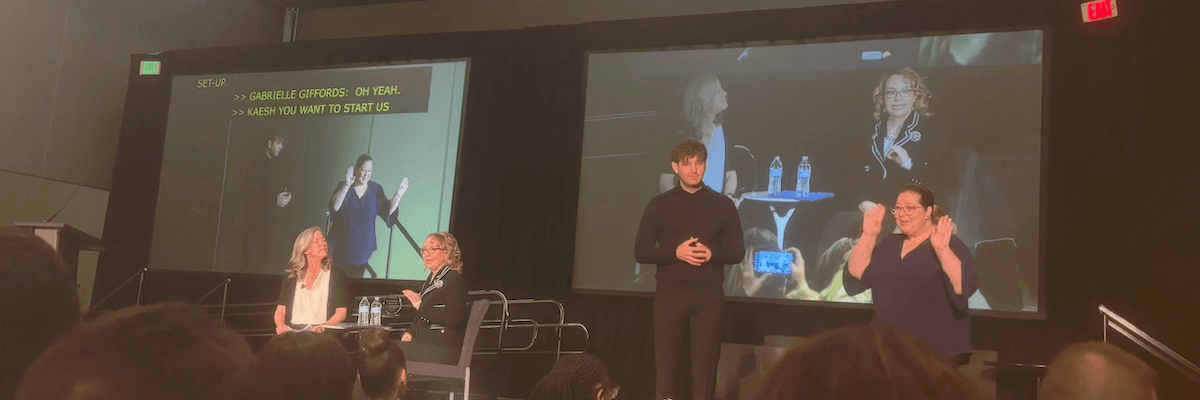
Gabby Giffords and her speech pathologist deliver the CSUN 2025 keynote speech. The pair are broadcast on a large screen while ASL interpreters and on-screen captions ensure that everyone present can understand what is being said.

The main auditorium was packed when I arrived for Congresswoman Giffords’ speech. Making my way to the front, I found an open aisle seat in a noticeably quiet section. While the rest of the hall buzzed with conversation, this area was almost completely silent. Curious, I glanced around, trying to understand why. It didn’t take long to realize something striking—no one was speaking verbally. Instead, this section of the room was alive with visual communication.

Across the hall, two women were signing to each other from an impressive distance, effortlessly maintaining their conversation. At the front of my section, an ASL interpreter conveyed the speakers’ words, while the speakers themselves were projected onto a large screen behind. In another section, a similar setup included captions alongside the interpreter, ensuring full access to the message being shared. About halfway through the two-hour session, the ASL interpreter seamlessly switched out with another, a transition that was smooth and efficient, reinforcing the professionalism and coordination of accessibility services at the event.

Sitting there, I found myself captivated by the experience of being immersed in a Deaf space, observing the richness of sign language and the seamless communication happening around me. It was a humbling reminder of the diverse ways in which people engage with the world and an eye-opening moment of appreciation for accessibility in action.

Follow me…I think?

There were a few times that I was the person in the room with the most sight. The irony was not lost on me as I wandered through the hotel lobby, “leading” a fellow attendee who was totally blind while trying to find the elevator. Another time, I helped three blind women locate the dog relief area for their service animals.

Throughout the conference, whenever I hesitated while looking for the right way to go or strained to read a sign, a conference staff member would approach me and ask if I needed assistance. I felt seen and accepted, and in turn, I found it easy to embrace and support others with different disabilities.

Speaking About Empathy

It was an incredible experience to share my thoughts on building empathy to drive accessibility initiatives within organizations. My session started with some technical difficulties—the microphone and projector weren’t cooperating—but the interactive nature of the talk saved the day. While troubleshooting the issues, I had attendees pair up and dive into one of the hands-on activities.

People seemed to genuinely enjoy the presentation. At the end, one gentleman told me it was the best session he attended at the conference. Another woman approached me about the possibility of doing public speaking with her for blind and low-vision students.

The response was more than I could have hoped for, and I am so grateful for this opportunity.

Final Thoughts

CSUN 2025 was a conference unlike any other. It wasn’t just about learning—it was about connection, shared experiences, and seeing accessibility in action. Whether it was being immersed in a Deaf space, connecting with fellow attendees with different disabilities, or receiving meaningful feedback on my own talk, I left feeling inspired, challenged, and deeply grateful to be part of this community.

I can’t wait for next year. In a time when digital accessibility finds itself in a chaotic and uncertain space, CSUN was a beacon of hope. The conference reminded me that despite the challenges, passionate advocates, inspiring technologies, and strong communities continue to push accessibility forward. CSUN 2025 reinforced just how much progress is being made in accessibility, from innovations in assistive technology to the unwavering dedication of the people driving these changes forward. More than just a conference, it was a reminder of the impact of community, collaboration, and commitment to inclusivity.

Share This

The best of axe-con 2025

The best of axe-con 2025

axe-con is the annual, virtual, free, digital accessibility conference presented by Deque Systems. This was my fifth time attending the event, and as usual, it did not disappoint. Here’s a rundown of some of my favorite sessions from axe-con 2025.

Each heading below links to the YouTube video for its corresponding session. At the time of this writing, axe-con 2025 session videos are not linked from Deque’s YouTube page. To watch other session videos from the conference, you can register for an axe-con account, view the conference agenda, and follow the links in the schedule to the session videos you want to view.

The Digital Accessibility Legal Landscape with Lainey Feingold

Lainey delivers a thorough overview of the current a11y legal environment, including federal, state, and global laws. There are simultaneously several encouraging and deeply concerning developments unfolding.

Here’s the good news.

  • The European Accessibility Act (EAA) goes into effect this June and has global impact, requiring products created in any country worldwide and offered in the EU to be accessible.
  • The ADA Web + Mobile Rule gives teeth to the Americans with Disabilities Act when it comes to federal, state, and local websites and apps.
  • Attorneys General from 16 states have issued a public statement affirming that DEIA is lawful and best practice.

And the not-so-good news.

  • The Trump administration issued an executive order ending DEI programs in the federal government, emboldening several large corporations to do the same.
  • 17 states filed a lawsuit against Section 504 which protects disability rights for healthcare, education, and more. The lawsuit is directly aimed at removing the classification of gender dysphoria as a disability, but it also seeks to overturn the law entirely

Lainey maintains an optimistic tone throughout her presentation, emphasizing that digital accessibility is a civil right. She highlights the strong legal protections in place for people with disabilities in the US despite the challenging political climate. She also stresses the importance of proactive measures and community advocacy. I really appreciate her digital accessibility joy plan, which provides a great strategy for staying positive during these chaotic times.

Favorite quote: "Don’t obey in advance." – Timothy Snyder, On Tyranny

Inclusive Design Patterns for 2025 with Vitaly Friedman from Smashing Magazine

Vitaly explores the latest concerns and techniques for creating more accessible and user-friendly designs. He kicks off his presentation with practical tips for accommodating color-blind and motion-sensitive users.

  • Prefer blue hues and ensure significant lightness variation between colors.
  • Align animations with natural physics (i.e. avoid horizontal scrolling with the mouse wheel).
  • Provide controls to toggle or skip motion and animations.

My favorite part of this session is about designing for Gen Z. Vitaly shared several fascinating observations about how people born between 1995 and 2010 behave online.

  • A large portion of Gen Z is mobile-only, not just mobile-first.
  • They typically ignore or close cookie banners and other popups or ads.
  • They turn on closed captioning by default.
  • They prefer social sign-in and authentication mechanisms.
  • They like bold and vibrant color schemes.
  • They are likely to trust only verified reviews.
  • They are open-minded and happy to share feedback.
  • They care about diversity, inclusion, sustainability, and accessibility and expect these to be the default experience.

Vitaly argues that the best way to reach Gen Z with our designs is to be authentic and show what matters by organizing the relevant content when and where it is needed. For example, why not embed a newsletter sign up form into a product detail page just above the "Add to Cart" button instead of putting it in a noisy popup that will just be dismissed?

Vitaly rounds out his talk by addressing design needs of the aging population. There are currently one billion people in the world age 60 or older, and they want large fonts and target areas, high-contrast visuals, and clear descriptions to help them be independent.

Favorite quote: "Gen Z…is an incredible example of an accessibility-first generation. "

It’s Alive! Facing The Monsters of Accessible Live Regions by Daniel Yuschick

A smiling cartoon zombie with pink hair atop a bare skull wearing a light t-shirt and dark grey jacket stands in front of an exploding orange light.

Daniel unpacks the importance of live regions in web accessibility using the running example of a Zombie named Romero who uses a screen reader to shop an undead cuisine e-commerce site.

At a technical level, live regions are HTML tags whose contents are announced to screen readers and other assistive technologies when they change. Daniel explains that live regions are the bridge between real-time updates and real-world people. They communicate vital information to users who cannot perceive modifications to content on a webpage.

There are a few ways to implement live regions, each well-suited for different purposes.

  • The aria-live attribute flags an element as a generic live region whose entire contents will be announced when they are updated. It works well for communicating shorter messages but isn’t the best choice for larger bodies of content, such as predictive search results that change with every letter typed.

  • Accessible roles (assigned with the role="alert" and role="status attributes) only announce updates to the content within an element. This makes them more nuanced than aria-live; they can be used to convey the most relevant data, such as the number of results returned in predictive search. Accessible roles also work with other ARIA attributes such as aria-labelledby, which further increases their flexibility.

  • The <output> HTML tag is ideal for communicating the result of an action. It connects to an input field and (with a little JavaScript) announces its contents when the value of the input changes. For example, an <output> tag in a shopping cart application might contain the total cost of an item which gets announced whenever the item’s quantity is updated.

Favorite quote: "Accessibility is the difference between including or excluding people, even zombies, from modern life." – Romero the Zombie.

Did you attend axe-con 2025? What were your favorite sessions?

Share This

Reaching the Cookie Jar: Creating an Accessible Cookie Banner

Recently, I needed to update my daytime employer’s home-grown website cookie banner, so I took the opportunity to ensure it was more accessible. Since cookie banners are legally required and designed to immediately capture users’ attention, they often struggle with accessibility challenges that must be addressed carefully. Here are the decisions and steps I made to enhance the banner’s accessibility.

A cookie banner with the heading 'Your Personal Information' reads 'Information about your browsing activity on our website, Including clickstream and cookie data and identifiers, is sent to our service providers and advertising networks. Please see our Privacy Policy, for more Information. You acknowledge and consent to these communications by browsing our website. In addition, we use cookies and other analytics tools to deliver the best experience. These tools allow us to measure website traffic, improve website performance, personalize advertising and web experiences, design targeted marketing campaigns, and allow content sharing to social media.' 'Manage Cookies' and 'Accept All' buttons follow this text.

The updated cookie banner with improved accessibility.

Structuring the Cookie Banner with Semantic HTML

First, I ensured the HTML was properly structured:

  • The “Your Personal Information” heading used an <h3> tag for proper hierarchy.
  • The “Accept All” button is an actual <button> element because it performs an action (granting cookie consent).
  • The “Manage Cookies” button, however, is a link since it takes users to a separate page. I styled it to look like a button while keeping it an <a> tag for correct semantics.

Handling Keyboard Focus and Navigation

Keyboard accessibility for cookie banners can be tricky. The banner must be noticeable but should not block users from browsing the site if they choose not to interact with it. Here’s how I tackled this:

  • I made the cookie banner a region landmark so screen readers can easily find it.
  • When the banner appears, keyboard focus moves to it automatically. The cookie banner component is located at the end of the DOM, which is appropriate since it appears at the bottom of the page. Focusing on it right away ensures that it gets appropriate attention from assistive technology users.
  • Once the banner is dismissed, keyboard focus returns to the last active element to prevent users from getting lost.
  • No keyboard trapping—users can navigate outside the banner without being forced to interact with it.
  • I avoided using a modal/dialog box for the banner, as this would prevent users from interacting with the rest of the page until the banner was dismissed.

Improving Visual Clarity and Contrast

To enhance readability and usability:

  • The “Privacy Policy” link was previously hard to spot, so I made it bold and underlined to stand out and look like a link.
  • I reversed the color scheme between the “Manage Cookies” and “Accept All” buttons to make them visually distinct.
  • I ensured that text and background colors met contrast requirements for accessibility.
  • The privacy icon containing a checkbox and “X” is purely decorative and has an alt="" attribute so screen readers will skip it.

Potential Further Accessibility Improvements

While I made significant improvements to the cookie banner’s accessibility, there are still areas that could be enhanced further:

  • Simplifying the language – I wish I could have made the banner text shorter and clearer, but our legal team mandated the exact wording. A more user-friendly version would help improve comprehension.
  • Enhancing animation and transitions – Smooth transitions when the banner appears and disappears could make the experience feel less jarring, especially for users with cognitive disabilities.
  • Adding a “Close” button – A dedicated close button could allow users to dismiss the banner immediately. However, this would require careful decisions about what happens in the background—does clicking it implicitly grant consent? Should the banner reappear on subsequent pages? These considerations need to be addressed to maintain compliance and user control, and I just didn’t have time to think through them.

Conclusion

By ensuring a website’s cookie banner is easy to navigate, understand, and interact with, we create a better and more compliant experience for all visitors. If you’re creating or updating your own cookie banner or selecting one from a third party, I hope my experience can help you think through the process.

Share This

Blind Sight: Why did the blind guy cross the road?

I live near a very busy intersection just outside of Boston, Massachusetts. The stereotypes you may have heard about Boston drivers being overly aggressive are often true, and there have been numerous occasions on which I have feared for my safety while crossing this street, even when the "Walk" sign is on.

I am legally blind, but I have a fair amount of usable vision. Because of this, I don’t typically use a cane to get around familiar places. However, a cane isn’t just for the blind person. It’s also to alert those near the blind person so they can adjust course or move out the way.

One Sunday afternoon, I decided to perform an experiment to see if drivers would respond differently to pedestrians crossing my busy intersection with and without a cane.

Here’s what happened.

A couple notes:

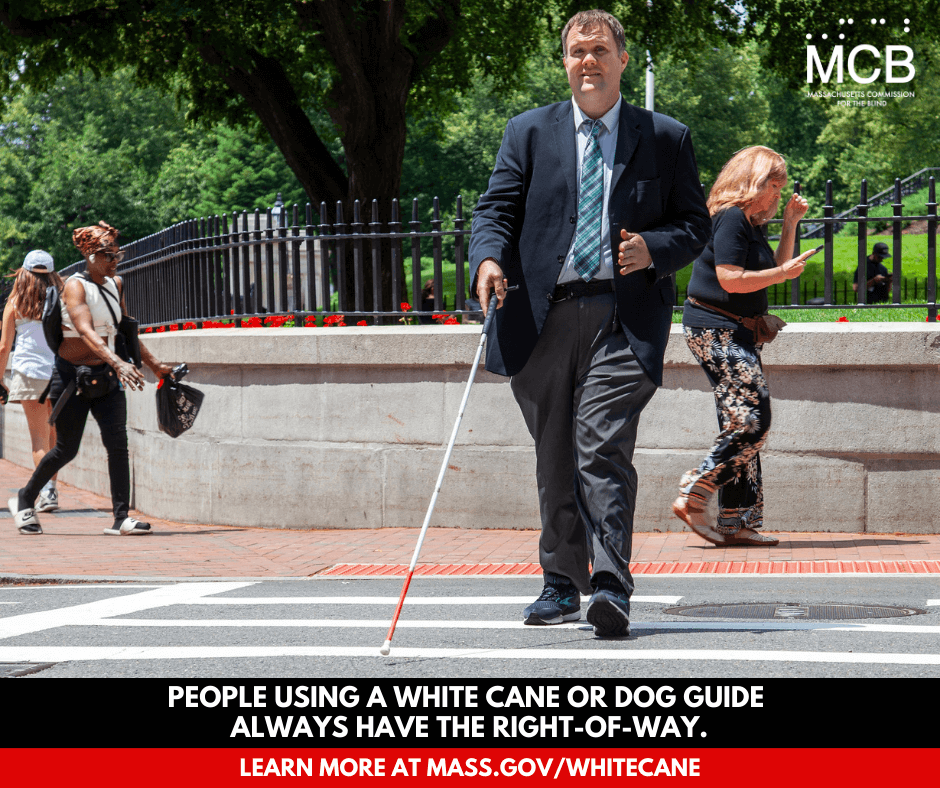
  • It’s legal for drivers can turn right on a red light, but this right is superseded by the Massachusetts White Cane Law, which requires drivers to stop for a blind person crossing the street. Violators of this law can face fines of up to $500. Massachusetts holds a White Cane Awareness Day Celebration every October to promote knowledge and understanding of this law.

    A man uses a white cane while crossing a city street; a caption reads 'People using a white cane or dog guide always have the right-of-way - learn more at mass.gov/whitecane'
  • My city had recently repaved this intersection and had not yet painted its crosswalk lines. This may have made it challenging for drivers to tell where the crosswalks were.

  • After crossing and recrossing the street with my cane, one gentleman approached me and asked if I needed assistance. I told him that I was practicing using my cane at the intersection, but I really appreciated his offer.

More Blind Sight articles

White silhouettes of a man and a woman dance beneath the Disability Pride flag. The man is holding a red-tipped cane in one of his hands. Blind Sight: The Pride Behind the Pride, a Thank-You to Those Who Dance with Us July is Disability Pride Month—a time to honor the experiences, rights, and dignity of people with disabilities. This month, many of us assert our identities, share our stories, and push for change in a world not yet built with us in mind. But today, I want to use this moment to shine a light in a different direction.
Cars zoom through a busy intersection with a brightly painted crosswalk and overhanging set of stoplights Blind Sight: Why did the blind guy cross the road? I am legally blind, and I live near a busy intersection near Boston. I don't typically use a cane to get around familiar places, but this intersection is still challenging when drivers don't observe the walk signals. I wondered if anything might change if I used my cane. Here's what happened.
The hammers beneath an upright piano cover above the instrument's keys Blind Sight: More on how a blind guy learns to play piano Additional thoughts on how blind people can become proficient at playing the piano.

Share This