

Several weeks ago, I wrote about how to choose accessible color combinations for text and backgrounds. However, sometimes navigating color contrast involves more than just two colors. Gradients, patterns, text decorations, images, and more can impact the readability of text.
I want to build upon my previous article on color contrast to address common situations that may require a little extra consideration to ensure adequate contrast between text and backgrounds. To do this, I’ll use an example from a forum that most people are familiar with — social media posts.
Busy backgrounds and tricky text
Many social media platforms provide the ability to choose predefined background for shorter posts Here is a screenshot of a Facebook post I created using one such background. Unfortunately, this feature made it really easy to create a thoroughly inaccessible post.
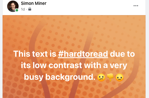
There are several color contrast issues here
-
The white text is difficult to read against the light orange background, particularly in the first line where the gradient is lightest. The orange hue shifts from darker to lighter orange traveling diagonally from the bottom-left to top-right of the post. Although the start of the final line of text adequately contrasts with its background color, the difference between the word “to” at the end of the first line and its orange backdrop is too slight. Its color contrast is significantly less than the minimum required contrast ratio for larger font sizes.
-
The background pattern makes it challenging to parse the words in the message. I find that the darker orange spots and lines behind the text require me to focus on each letter to identify it, which drastically slows down my reading and comprehension. I imagine that other people with, and maybe without, vision disabilities also experience this obstacle.
-
The
#hardtoreadhashtag is underlined. This indicates that it’s a link, which in theory is good. However, in the context of this post, the extra line beneath the tag adds more clutter to the mix, making the hashtag harder to read and interact with. It’s also confusing, as we typically do not encounter or expect hyperlinks atop decorative backgrounds. - The emojis at the end of the message are mostly yellow and orange, which makes them particularly challenging to recognize against such a similar background color. I need to concentrate pretty hard to make out the thumbs-down icon, and I already know it’s there.
There are a number of color contrast guidelines we can infer from the accessibility barriers in this example post.
-
Choose clean and uncluttered backgrounds for your text.
-
If you want to use a background with a color gradient, be certain that all its colors contrast adequately with the text in front of them.
-
Avoid background patterns underneath the text as they can make the message harder to read. Stick to patterns that are confined to the post’s margins and don’t collide with the text.
-
Watch out for emojis in posts with backgrounds. Chances are that an emoji will be a different color than the message text, so you’ll need to make certain it too contrasts adequately with the background color
- Shy away from links in posts with custom backgrounds, as their purpose is unclear. Their underlines and special characters are more likely to clutter and confuse than encourage users to click.
Below is another Facebook post with a different predefined background. This one observes the above guidelines and avoids the barriers of the previous example. After viewing the post on both my laptop and phone, I needed to manually reposition some words on different lines with newline characters (using the Enter key) to make them flow properly, but this minor effort makes the post much more accessible.

Beyond social media
The accessible color principles outlined in this article apply to much more than social media posts. They are relevant to any sort of digital or print media that incorporates backgrounds and other non-text elements — slide decks, reports, websites, brochures, flyers, posters, and the list goes on.
Here are a few more general principles to help you ensure good color contrast in your documents.
-
Good text and background color contrast is especially important for presentations created with programs like Microsoft PowerPoint, Google Slides, or Apple Keynote. During a presentation, people will likely be viewing the slides from greater distances than the space between their eyes and phone or computer monitor.
-
Ink-based colors on the printed page are different from their light-based counterparts on a screen. Before making dozens of hard copies, print a single copy to check that the text and background colors in the document have adequate contrast on paper. This will be more subjective than measuring color contrast in a digital environment, but it’s still a vital step to keep your content accessible in the physical world.
-
Be mindful of individuals with colorblindness when choosing colors. Certain combinations of colors like red and green are difficult or impossible for some people to distinguish. It’s a good idea to test your documents with a color blindness simulator to get an idea of how others might perceive your work.
- Consider the possible contexts in which people will engage with your work. Lighting conditions will probably not always be optimal. For instance, if a reader is outside squinting at their phones in the bright sun, good color contrast will likely be a determining factor in whether they read your content or skip over it.
With tools like Color Safe, picking an accessible background color for text is straightforward, but the art of good color contrast is much more nuanced. Using the techniques in this post will help ensure that your text and background elements stand out from each other, are perceptible to your readers, and steer clear of the most common web accessibility barrier.
Update:Danielle Zacaro shared a link to a text on background image a11y check tool that validates color contrast for an image, string of text, and background color you speciy.
More WebAIM Million articles
 The WebAIM Million: What Changed from 2024 to 2025? The web is slowly getting more accessible—but not fast enough. Each year, WebAIM scans one million home pages for accessibility issues. I’ve pulled the biggest insights from the 2024 and 2025 reports so you can see what’s improving, what’s not, and what it means for your website.
 A non-techie’s guide to choosing accessible color combinations Insufficient contrast between text and background colors is the most common accessibility issue on the web. However, choosing accessible color combinations doesn't have to be difficult. Here's a step-by-step process for doing so that requires zero technical knowledge.
 Here’s a simple recipe for good image alt text Answering three simple questions about an image can make it easy to create alternative text that's meaningful and relevant.