

Each year, WebAIM releases a report on the accessibility of the top 1,000,000 home pages on the web. The 2024 WebAIM One Million Report found that 95.9% of these home pages have accessibility issues that can be automatically detected.
This isn’t great news, but there is a silver lining. Most home page accessibility shortcomings can be classified into a small set of just six problems, each of which you can learn to recognize and fix with a little reading and practice, regardless of your technical ability. This post is the first in a series of articles covering these top WebAIM One Million issues and how to address them.
Missing alternative text for images
Images on web pages mean nothing to people who cannot see them unless those images have associated textual descriptions. This alternative text, or “alt text” for short, is a brief written description of an image that can be parsed by assistive technologies like screen readers and refreshable Braille displays. These tools then communicate the alt text to blind and visually impaired users in a format they can perceive such as spoken word or touch.
While automated tools can tell when alt text is missing from an image, they cannot determine the quality of that text when it is present. I can’t tell you how many times I’ve encountered image descriptions like “picture,” “line graph,” or “a person walking.” Vague placeholder descriptions like these are unhelpful and annoying.
There are numerous services available that use artificial intelligence to generate image descriptions. While text from these solutions can provide a starting point, they still need to be reviewed, enhanced, and corrected by a real person. This is because AI cannot understand context. In another post, I discussed how a picture of a stoplight can have very different meanings depending on the content surrounding it. It might convey one thing in an article about traffic problems but quite another as part of a warning against consuming too much alcohol. Good alt text is an art that requires a human touch.
This article is not a primer on image descriptions. The W3C has a great tutorial on accessible images that you should go through if you are new to the topic. Instead, I want to share a simple strategy that I use to create meaningful and relevant alternative text.
The ingredients for good image descriptions
Good alt text often lives at the intersection of three factors.
Content
What is in the image? What does it depict, and what elements does it contain? What are the defining features and visual characteristics of each item? Image content can include people, other living things, objects, text, color, patterns, and virtually anything else that can be described. While an image may have a main subject or focal point, its content is usually more extensive.
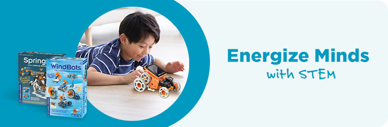
The preceding image shows a young Asian boy in a blue striped shirt lying on the floor and playing with a yellow vehicle built from a MindBots toy construction set. It also contains two boxed MindBots kits and the text “Energize Minds with STEM” with the words “with STEM” printed in handwriting-style font. The picture of the boy is circular and surrounded by a soft blue background which also sits behind the MindBots kits. The text is written in the same blue color.
Although this description is accurate and somewhat comprehensive, it’s very long and does not indicate the relative importance of the various elements in the image. While an image’s content may be a good place to start, it’s generally too broad on its own for alternative text.
Context
What is around the image? What neighboring content does it support and supplement? How does the image fit with its surroundings?
The image at the beginning of this section was copied from a page on an e-commerce website featuring home education products. The page advertises toys, games, and puzzles to help children discover and learn about science, technology, engineering, and math. Each product includes a title, price, description, and “Add to Cart” button.
Taking an image’s content and context together allows us to infer how it is relevant to its setting and which of its features might be most important. These two factors often point directly to the final alt text ingredient.
Purpose
Why is the image present? What does it communicate to the user? How does it contribute to the overall message of its setting?
In the context of a webpage of STEM homeschooling products, the image of the boy playing with the MindBots set is meant to convey a sense of fun engagement. It is there to pique a sense of curiosity and delight in building and learning new things.
Combining the components of content, context, and purpose, and keeping best practices for brevity and composition in mind we might choose alternative text like “A young Asian boy plays with a vehicle built with a MindBots construction set; adjacent text reads, ‘Energize minds with STEM.'” for this image.
Examples
Now let’s practice putting this strategy into action with different kinds of images.
Images with text
In general, images of text should be avoided. If the image really needs to contain text, all of this text must be included in its alternative description.
For the image in the previous section that advertises homeschool STEM products, “Energize minds with STEM” is appropriate (albeit minimal) alt text because it conveys the essential content and purpose of the image and compliments its context on a home education product listing page. However, “”A young Asian boy plays with a vehicle built with a MindBots construction set; adjacent text reads, ‘Energize minds with STEM.'” may be more effective as it provides a fuller description of these factors while still being clear and concise.
Photographs

Photos typically contain lots of content. This image shows a smiling young black girl with raised arms sitting in a red tote sliding down a conveyor belt in a distribution center. She is wearing a red shirt and jeans. The conveyor belt is black. The image also shows machinery and conveyors carrying boxes in the background. What’s relevant here?
To find out, we need to examine the context surrounding the photo. An excerpt of the web page on which the image resides contains adjacent text that talks about the importance of “work family” and indicates that the picture was taken at an organization’s Bring Your Child to Work Day.

The purpose of the image can be derived from this context. The photo is an example of the fun and memorable times employees and their families experience at Bring Your Child to Work Day. It’s here to elicit laughter, nostalgia, and a feeling of delight.
One important note is that the girl is not actually riding a tote down the conveyor. This would be dangerous and probably not lead to family fun. This picture was actually taken with the girl sitting in the tote in front of a green screen. The conveyor belt and other background was added after-the-fact. This can be inferred from the subtle visual cue that the scale of the girl and tote does not quite match that of the conveyer. This is a helpful detail that should be included in the image alt text.
With these factors in view, a suitable alt text for the photo on its web page might be something like “A doctored photo of a young black girl sitting in a red tote zooms down a distribution center conveyor belt.” There’s no need to mention family fun or Bring Your Child to Work Day in the image description because these details are given in the adjacent text.
Informational or Complex Images
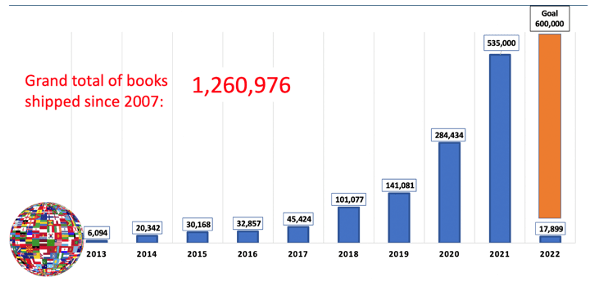
Images that communicate data require special consideration. There is a lot of content in the bar chart depicted here. Besides the text indicating the grand total of books shipped, each bar on the chart has an associated book count and year. Alternative text would not be sufficient to fully describe this image; its data would need to be formatted as nearby text in the document, probably in a table.
However, context again is key. The following image shows the chart in its setting, a newsletter for a nonprofit organization. The text following the bar chart indicates that the organization achieved non-profit status earlier in the year. This and other neighboring content make clear that the newsletter is meant to encourage readers about the progress the nonprofit organization is making.
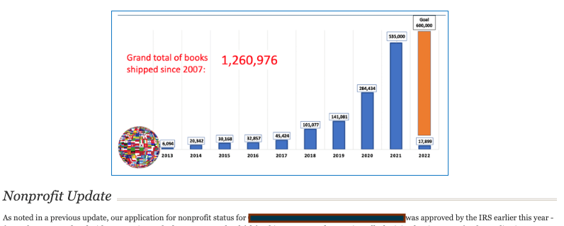
As before, the image’s content and context inform its purpose. The bar chart is present to illustrate the increasing number of books the nonprofit has shipped year over year. The actual numbers are not as important, except for the grand total embedded in the text within the image. Combining these ingredients leads to meaningful alt text like “A bar chart showing the increasing number of books shipped year over year with the text ‘Grand total of books shipped since 2007 – 1,260,976.'”
Conclusion
One way to create effective alternative text for an image is to ask three simple questions.
- What is in the image? (content)
- What is around the image? (context)
- Why is the image present? (purpose)
The point where the answers to these questions overlap will likely inspire a meaningful text description for the image. I have found that taking this description and finessing it to be clear, concise, and uncluttered usually produces high quality alt text.
More WebAIM Million articles
 The WebAIM Million: What Changed from 2024 to 2025? The web is slowly getting more accessible—but not fast enough. Each year, WebAIM scans one million home pages for accessibility issues. I’ve pulled the biggest insights from the 2024 and 2025 reports so you can see what’s improving, what’s not, and what it means for your website.
 Color contrast in the real world: strategies for accessible text with complex backgrounds Picking an accessible background color for text is straightforward, but the art of good color contrast gets more nuanced for backdrops with multiple colors and other visual effects. Here's how to ensure your text and background elements stand out from each other and avoid the most common web accessibility barrier.
 A non-techie’s guide to choosing accessible color combinations Insufficient contrast between text and background colors is the most common accessibility issue on the web. However, choosing accessible color combinations doesn't have to be difficult. Here's a step-by-step process for doing so that requires zero technical knowledge.