

81% of homepages tested in the 2024 WebAIM Million report have at least one instance of low contrast text. In digital accessibility, color contrast, also known as relative luminance, is a measurement of the difference in brightness between two adjacent or overlaid colors. Insufficient color contrast between text and background colors is the most common accessibility issue on the web.
Web designers use several methods to specify the exact colors we see on our screens. One of these is hexadecimal color codes). A "hex code" is a string of 6 numbers between 0 and 15, where the letters "A" through "F" represent 10 to 15, to communicate the amount of red, green, and blue (RGB) in a particular color. The contrast between two colors can be calculated with a mathematical formula that yields something called a contrast ratio. Web standards set forth minimum contrast ratios that two colors positioned next to or on top of each other (like text on background) must meet to be considered accessible.
While nerds like me may enjoy diving into the intricacies of color science and its application to web accessibility, many people find this convoluted or just have better things to do. If that’s you, I have good news. You don’t need to understand any of this to choose colors with good contrast. In this post, I’ll show you a quick and easy way to create accessible sets of colors without requiring any technical knowledge.
Why is color contrast important?
Before looking at how to pick accessible color combinations, it’s helpful to understand the wide range of people who benefit from them.
-
People with visual impairments: Individuals with various types of visual impairments, such as low vision and color blindness often struggle to distinguish text from its background if the contrast is too low. High contrast makes text more readable.
-
Older adults: As people age, their vision tends to deteriorate. Older adults may find it difficult to read low-contrast text. Good contrast can help mitigate the effects of aging eyes.
-
People with cognitive disabilities: Clear and distinct text can help users with dyslexia, ADHD, autism, and other cognitive disabilities better understand content. Reduced visual confusion aids in comprehension and navigation.
- People using mobile devices: In bright light conditions, such as sunlight, low-contrast text can be hard to read, especially on screens. High contrast improves readability when we encounter these situational disabilities/
Good color contrast is good for everyone. Accessible color palettes enhance the readability and usability of websites for all users, making content easier to read and navigate, and improving the overall user experience.
Use this website to pick a pair of accessible colors
-
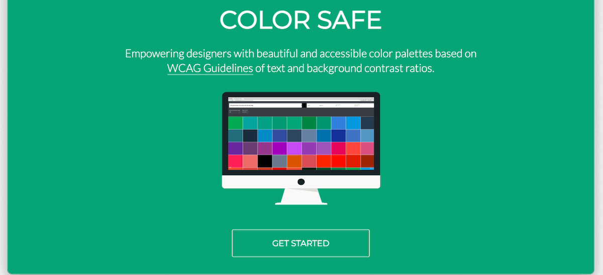
Head over to the Color Safe website created by Donielle Berg and Adrian Rapp and press the Get Started button.

-
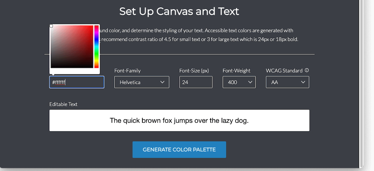
The page should scroll to a form with fields with labels like Background Color, Font-Family, and Font-Size. You’ll notice that the Background Color field is prefilled with the value
#ffffff— this is the hexadecimal code for white. When you click your mouse on or tap on this field, a color picker widget like the one pictured below should appear. -
Press a point on the vertical spectrum on the right side of the color picker widget to select a general color like red, yellow, or blue. Once you choose a general color, the smooth square palette on the left will update to display a two-dimensional gradient of variations for that color. Clicking or tapping points in this space will change the hex code in the Background Color field to match the selected color. Doing this will also switch the background color of the Editable Text field to your chosen color.
-
Once you find a background color you like, make note of its hex code in the Background Color field, including the leading
#character. -
Optionally, modify the values of the Font-Family, Font-Size, and Font-Weight fields. You don’t need to worry about the value in the WCAG Standard field right now.
-
Press the Generate Color Palette button at the bottom of the form.
-
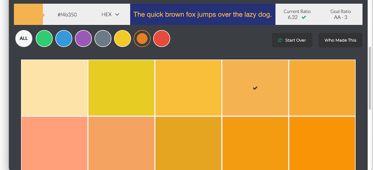
The page should scroll again to reveal a swatch of accessible text colors for your chosen background color. You can filter these by the general colors displayed at the top left.
-
Click or tap a color in the swatch to display its hex code in the field above the color filters. The editable text field at the top center of the page also updates to show a preview of text with this color atop the background color you picked in the previous step.
- Click or tap the text color hex code to copy it to your clipboard. Paste this value in the same location as your background color.

A few notes on the Color Safe tool:
-
The Font-Size influences the number of potential text colors available. In particular, values smaller than 18 will yield fewer choices. This is because larger fonts are easier to read and can still be accessible when there is lower contrast between their text and background.
-
The WCAG Standard field allows you to toggle between levels AA and AAA. AAA is stricter and requires more contrast, so choosing this level will produce fewer text color options. In most cases, level AA color contrast is sufficient. However, government agencies and organizations expressly serving people with visual impairments or other disabilities may need to meet AAA contrast levels.
- You can see the current and goal color contrast ratios at the top right of the color swatch screen. The goal ratio is determined by the values you choose for the Font-Size and WCAG Standard.
What to do next
Once you have a pair of accessible text and background colors, it’s time to apply them to your content.
-
If you have a designer or developer working on your website, you can give them the text and background color hex codes to use in their designs, pages, and web applications.
-
Most modern website building software like WordPress and Wix offer the ability to customize text and background colors within their theme or page configuration settings. If you run your website yourself, consult your software documentation or do a Google search to find details on how to customize text and background colors.
- Accessible text and background colors aren’t just for web pages. Any electronic document that contains text should use good color contrast. Most office software suites including Microsoft and Google provide the ability to set text and background colors.
Choosing accessible combinations for text and background colors doesn’t have to be difficult. Using the Color Safe website and the process outlined above, you can select colors with good contrast and make your content more inclusive to everyone.
More WebAIM Million articles
 The WebAIM Million: What Changed from 2024 to 2025? The web is slowly getting more accessible—but not fast enough. Each year, WebAIM scans one million home pages for accessibility issues. I’ve pulled the biggest insights from the 2024 and 2025 reports so you can see what’s improving, what’s not, and what it means for your website.
 Color contrast in the real world: strategies for accessible text with complex backgrounds Picking an accessible background color for text is straightforward, but the art of good color contrast gets more nuanced for backdrops with multiple colors and other visual effects. Here's how to ensure your text and background elements stand out from each other and avoid the most common web accessibility barrier.
 Here’s a simple recipe for good image alt text Answering three simple questions about an image can make it easy to create alternative text that's meaningful and relevant.
Hi Simon, the Color Safe Website link is not secure. I even Googled it and the site is missing its SSL. Could you maybe reach out to them and let them know? Looks like a great tool.
Laura
I noticed that as well, Laura. I contacted them about adding an SSL certificate to their website. We’ll see what happens…