Guided Alt Text Generation: fill in the blanks, get alt text that actually works

A couple years ago, I wrote about a simple recipe for good image alt text: good alt text lives at the intersection of three ingredients. Ask three simple questions about an image, content, context, purpose, and you’ll land on a description that’s meaningful instead of generic.

  • What is in the image? (content)
  • What is around the image? (context)
  • Why is the image present? (purpose)

That post was about how a human should think through alt text. This one is about how to get an AI to think through it the same way, on the first try, instead of forty follow-up prompts in.

The problem with “generate alt text for this image”

It’s an easy trap to fall into once you start leaning on AI for accessibility tasks: upload an image, type “generate alt text for this image,” and get back something like “a photo of a building and some people outside.” Technically accurate. Completely useless. It’s the same complaint I raised in the original recipe post about AI-generated descriptions in general: the tool has no sense of context, so it can’t tell you why an image is there or what it’s doing for the page around it. The AI has none of the three ingredients. It’s guessing at content and skipping context and purpose entirely, because nobody handed those to it.

The fix isn’t a better model. It’s a better prompt. And the prompt writes itself once you notice that the three questions from the recipe map directly onto three prepositions.

Guided alt text generation

Here’s the template:

Give me alt text for this image of [content] for [purpose] about [context].

Fill in the three blanks and you’ve handed the AI everything it needs, in a form it can actually use.

“Of” carries the content. This answers what is in the image? What’s literally in the frame? A crowd, a chart, a red brick building. This is the part AI is already decent at guessing on its own from the pixels. It’s the other two it can’t infer.

“For” carries the purpose. This answers why is the image present? Why does it exist on your page at all? Is it proving a point, setting a mood, illustrating a step? A photo of a chair reads differently depending on whether it’s decorating a lifestyle post or anchoring a furniture listing.

“About” carries the context. This answers what is around the image? What’s it sitting next to? A picture of a building means one thing in an article about spring weather and something else entirely in an article about the building’s history. Same pixels, different job, same lesson from the recipe post: content and context together are what tell you what actually matters.

Three blanks, three prepositions, the same three questions from the original post. Once you see the pattern, you stop typing “generate alt text” and start typing a sentence that already contains the answer.

Putting it to the test

Harvard’s Digital Accessibility Services has a great teaching example on their describing images page: a single photo of Harvard Yard, students lounging in colorful Luxembourg chairs with Hollis Hall’s brick facade behind them. They use it to show how the same image needs different alt text depending on the article it’s placed in, which is exactly the point the recipe post made with its own conveyor belt and STEM toy examples. It’s a good testbed for Guided Alt Text Generation, so I ran it through three scenarios.

Students relax in colorful Luxembourg chairs on the lawn of Harvard Yard, with Hollis Hall's brick facade in the background.

Photo courtesy of Harvard’s Digital Accessibility Services, used here as the shared image for all three scenarios below.

Scenario 1: the wrong way

Prompt: “Generate alt text for this image.”

Response: “Image of a building and people sitting outside.”

No content specifics, no purpose, no context. The AI filled the gap with the blandest true statement it could make, because that’s all it had to work with. This is what happens to most AI-generated alt text, and it’s a big part of why I tell clients that AI descriptions need a human review pass before they ship. The tool wasn’t given a chance to succeed.

Scenario 2: “Spring is here”

Imagine this photo running in an article celebrating the return of warm weather and the reappearance of Harvard’s Luxembourg chairs across the Yard.

Prompt: “Give me alt text for this image of students relaxing in colorful lawn chairs for an article entitled “Spring is Here” about the return of spring and the Luxembourg chairs to Harvard Yard.”

Response: “Students stretch out in bright yellow and green Luxembourg chairs scattered across the lawn of Harvard Yard, with Hollis Hall’s red brick facade in the background.”

Notice what made the cut and what didn’t. The chairs and their colors matter here because they’re the whole point of the article. Hollis Hall gets a passing mention for orientation, not a starring role.

Scenario 3: “Famous residents of Hollis Hall”

Now imagine the same photo illustrating a history piece about Hollis Hall itself and its place on campus.

Prompt: “Give me alt text for this image of Hollis Hall’s brick exterior for an article on famous residents of the dorm about the building’s notable occupants and prime location next to Harvard Yard’s open lawn.”

Response: “Hollis Hall’s red brick facade rises beside the open green lawn of Harvard Yard, with students relaxing in colorful chairs on the grass in front.”

Same photo, same three prepositions, completely different emphasis. Hollis Hall now leads. The chairs are still there, because they’re still part of the frame, but they’ve been demoted to scene-setting instead of the headline.

That’s the whole trick. The image never changes. The alt text does, because the purpose and context did, and the AI knew that because we told it.

Try it yourself

Next time you’re tempted to type “generate alt text for this image” and hope for the best, stop and fill in the blanks first: what’s in it, why it’s there, what it’s sitting next to. You’ll spend fifteen extra seconds writing the prompt and save yourself several rounds of rewriting the output. And the same rule from the original recipe post still applies here: take whatever the AI hands back and finesse it until it’s clear, concise, and uncluttered. Guided prompting gets you a much better first draft. It doesn’t replace the human touch.
Share This

AI-Generated Code is Inaccessible by Default

I recently had the opportunity to present as part of the IAAP Professional Webinar Series with a session on AI for accessibility professionals. (Check out the slides.) One point in particular sparked some thoughtful conversation, so I want to spend a little more time with it here.

AI coding tools can turn a prompt into a polished interface with unnerving speed. That’s exciting and useful. It’s also risky. A working prototype can look like a finished product, but accessibility is often where the floorboards start to creak.

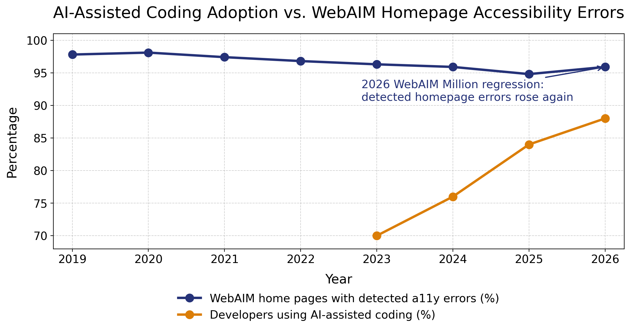
 Line graph comparing WebAIM homepage accessibility error rates with AI-assisted coding adoption from 2019–2026. The percentage of homepages with detected accessibility errors declined gradually from 98.1% in 2020 to 94.8% in 2025, but then rose again to 95.9% in 2026. During the same period, developer use of AI-assisted coding tools increased rapidly from 70% in 2023 to an estimated 88% in 2026.

The chart above puts two trends beside each other: WebAIM’s percentage of home pages with detectable accessibility errors and Stack Overflow’s AI-assisted coding data. Correlation is not causation, and there aren’t enough data points on the graph to draw conclusions. But it is a useful warning. Stack Overflow’s 2025 Developer Survey found that 84% of respondents were using or planning to use AI tools, up from 76% in 2024, with 51% of professional developers using them daily. . On that trajectory, AI-assisted coding appears on track to reach roughly 85% to 90% in 2026. Meanwhile, WebAIM’s 2026 Million report found that 95.9% of home pages had detectable WCAG failures, up from 94.8% in 2025.

AI inherits the web we already built

The problem starts with training data. AI coding tools learn from the internet, repositories, tutorials, snippets, design systems, and production code. Much of that material is inaccessible. Bad patterns are not edge cases in the training set. They are the training set–copied, pasted, shipped, forgotten, and then copied again.

Anna E. Cook makes this point beautifully her recent post AI Doesn’t Fix Accessible Systems. It Depends on Them. AI does not repair broken structure by magic. It depends on the structure it receives. Accessible systems are more structured, parseable, and interpretable by both people and machines. When source material lacks semantic HTML and inclusive design decisions, AI is more likely to reproduce structural debt than pay it down.

That’s why “vibe coding” should make accessibility professionals a bit nervous. AI may generate a nice-looking modal, carousel, or dashboard, but visual plausibility is not semantic accuracy. The code may use clickable divs instead of buttons, skip headings, hide focus indicators, omit labels, ignore reduced motion, or update content without notifying assistive technology. It may look done while quietly leaving many users with no reliable way through.

Automated scores are not lived experience

Hampus Sethfors’ Axess Lab review of a Lovable-generated conference site shows the gap between automated confidence and actual use. The site looked impressive and reportedly received a perfect accessibility score in Lovable’s built-in Axe-powered check. But when a screen reader user tested it on an iPhone, serious barriers appeared.

Focus moved behind open menus and ticket modals. A live region repeatedly interrupted the screen reader. Single-page-app navigation failed to place focus predictably. The menu button did not communicate expanded or collapsed state. Headings skipped levels. A visible “Get tickets” button had the accessible name “Register for tickets,” creating a mismatch that can break voice control.

Automated tools are essential, but they catch only part of the picture. They do not fully judge whether focus management makes sense, labels match visible text, or disabled users can complete real tasks. A clean automated score is helpful. It is not a permission slip to just trust AI-generated code and stop testing.

Songclock shows the promise and the labor

Last year, I wrote Songclock, an accessible audio clock built with Vercel’s v0, as an experiment in AI-assisted development. The app translates time into musical tones and evolved into an ear-training tool with intervals, dynamic scores, sound controls, and screen reader support.

I was excited by what AI made possible. and I still am. What might have taken weeks became about 15 hours of concentrated work. But the accessibility did not simply appear because I included “accessible” in the prompt and hoped the machine would take it from there. It took more than 20 prompts to improve keyboard usage, contrast, screen reader behavior, focus management, and communication of musical patterns.

That process included prompts for keyboard-accessible sliders and toggles, visible focus states, ARIA labels, Escape-key support, focus restoration, semantic headings, and live region announcements. AI accelerated the work, but accessibility emerged through explicit direction, testing, and revision. The tool generated code. Accessibility expertise made the end result usable.

That experience also lines up with Alexandra Elena Gurita and Radu-Daniel Vatavu’s recent Web for All paper, _When LLM-Generated Code Perpetuates User Interface Accessibility Barriers: How Can We Break the Cycle?. They found that accessibility-oriented prompts can improve generated interfaces, but persistent barriers remain, especially around semantic structure. In other words, prompting helps. It just does not replace knowing what good accessibility looks like.

Better AI needs better accessibility data

But there is also promising work happening. Eric Bailey’s GitHub article on building a general-purpose accessibility agent describes an experiment designed to give engineers just-in-time guidance and catch objective accessibility issues in pull requests. GitHub reported that the agent reviewed 3,535 pull requests and achieved a 68% resolution rate.

The key detail is the foundation. GitHub’s experiment relied on mature issue logging, consistent verification, and a structured body of accessibility knowledge. The agent improved because it was grounded in better accessibility data than whatever code happens to be on the open web. Current LLMs are trained on decades of inaccessible code, so better accessibility-specific source material is essential.

This is a hopeful path forward, but it is not a shortcut around accessibility practice. One of the more telling details from Bailey’s article is that GitHub had to create “anti-gaming” instructions so the LLM would not find sneaky ways around its own guardrails, especially when it had been told not to generate code for issues requiring human expertise. That little wrinkle says a lot. Even promising accessibility agents need careful constraints, high-quality data, and human oversight. Better tools can help developers catch more issues earlier, but they will not replace accessible design systems, manual testing, disabled user feedback, or people who understand how interaction patterns actually work.

Conclusion

AI-assisted coding is not going away, and I don’t think it should. It can help us move faster, explore ideas, and reduce some of the repetitive work that drains time from better judgment. But when it comes to accessibility, speed needs a steering wheel, brakes, and someone who knows where the potholes are.

In short:

  1. Right now, AI-assisted code is inaccessible by default. Treat it as a draft, not a deliverable. If the model learned from an inaccessible web, its output should be assumed suspect until reviewed.

  2. Accessibility needs to be explicit in your prompts. Ask for semantic HTML, keyboard support, visible focus, accessible names, headings, labels, focus management, live region behavior, reduced-motion support, color contrast, and usable error handling. Then test before moving on. In my experience, the best results come from an iterative rhythm: prompt for specific improvements, test the result, identify what still fails or feels awkward, and prompt again. Build, test, refine, repeat.

  3. Accessibility design and development skills matter more than ever. AI raises the floor for speed, but not for judgment. The more code AI generates, the more we need people who know how inclusive interfaces work and how to turn fast drafts into usable products.

What have you seen in your own AI-assisted coding work, is accessibility showing up right away, or only after you ask for it?

Share This

Introducing FAR, AMP, and LABS, Pedal Point’s new packages shaped by real work

I’m thrilled to share something Pedal Point has been working on all through 2025: three new accessibility packages crafted straight from client feedback and real service experience. These aren’t abstract offerings or checkbox audits. They’re designed to fit how teams actually work, solve real accessibility challenges at affordable costs, and help organizations build confidence and clarity around inclusive digital experiences.

Each package can stand on its own. You can start with one and add others later. And taken together, they form a practical pathway from understanding your current barriers to building internal capability and momentum.

Focused Accessibility Report (FAR)

For teams that want fast clarity and smart prioritization.

The Focused Accessibility Report (FAR) gives you a targeted deep dive into your site’s accessibility fundamentals, so you can see what’s blocking people and what moves the needle most quickly. A FAR looks at structural pieces common to every page—the header, footer, and other shared components—plus five pages of your choosing. That combination gives a well-rooted and holistic view of your site’s patterns, not just a handful of scattered pages.

One of my favorite parts of the FAR is how it opens: you get a top-5 list of high-impact accessibility wins right at the start. It’s a key takeaway before you even read the full findings. Then the report walks you through the issues with plain language, priority guidance, and realistic next steps—no jargon, just usable insight.

In just 5 to 10 business days, you can have the most important areas of your website tested and reviewed for accessibility in an easy-to-follow, immediately actionable report.

Learn more about the FAR.

Accessibility Momentum Program (AMP)

For website owners who want steady progress that sticks.

If a FAR gives you understanding, the Accessibility Momentum Program (AMP) gives you structure. This is a multi-month engagement built for consistency—not just “fix a few things and call it good.” With AMP, you get sustained accessibility enhancements, regular alignment with Pedal Point, progress checks, and planned action that fits your capacity and priorities.

We spread the work (and the cost) over time in a way that keeps your budget manageable while still moving forward. That makes accessibility improvements less overwhelming and more integrated into your workflow.

Along the way, you get regular summaries of what what’s been tackled and where things are headed next. That budget-friendly pacing and expert treatment means you can build accessibility momentum without burning out your team.

If you’re looking for a way to ensure accessibility improvements keep happening, even when your internal team is stretched thin, AMP provides a calm, reliable path forward.

Explore AMP.

Live Accessibility Building Sessions (LABS)

For teams who want to learn and do at the same time.

I’m particularly excited about Live Accessibility Building Sessions (LABS) because they blend action with education. These aren’t abstract trainings or slide decks that feel disconnected from your work. In LABS we sit down with your actual website and tools together—testing live, applying fixes, and explaining why we do what we do in real time.

You get both the benefit of expert testing and immediate treatment plus practical, contextual training for your team. Between sessions, your team gets space to practice implementing the fixes and enhancements we discuss. That space to apply what you’ve learned is where confidence grows. When we come back together, questions are sharper, understanding is deeper, and progress is tangible.

LABS is ideal for teams who want to build internal accessibility skills while still making real improvements to their site, guided by an experienced partner every step of the way.

Discover LABS.

Why these packages matter

What excites me most isn’t a new product lineup; it’s what these packages unlock for teams: confidence, clarity, and momentum. They take the mystery out of where to start, how to prioritize, and how to grow accessibility capability over time. Whether you need a quick and targeted review, ongoing partnership, or hands-on learning, there’s a grounded, practical way to move forward without reinventing the wheel.

Accessibility is a journey. With FAR, AMP, and LABS, you’re not walking alone—you’ve got a roadmap and support that meets you where you are.

If you’re curious which package fits your team, drop me a line and let’s talk it through. I can’t wait to collaborate and help empower accessibility in a more focused, flexible, and humane way.

Share This

How a 3-Minute A11y Snapshot Helps Me Turn Curiosity into Connection

Over the past several weeks, I’ve had the chance to engage with roughly 75 different potential leads through conferences, workshops, and speaking engagements. Along the way, I’ve been honing a new approach to sparking accessibility conversations, something I’m calling the a11y snapshot.

This quick, action-focused check was inspired by the Lightning Audit from Easy A11y Guides. It’s become one of my favorite ways to start meaningful discussions about digital inclusion because it gives real, actionable value — whether or not someone decides to work with Pedal Point.

How the a11y snapshot works

The a11y snapshot is simple, fast, and practical:

  1. Start a conversation. Ask a vendor about their product or service and listen carefully to understand what they offer.

  2. Bring up their website. Ask if they’ve made sure it’s accessible to people with disabilities.

  3. Offer value. If they’re unsure or say no, offer a complimentary a11y snapshot of their homepage — a quick review for common accessibility opportunities.

  4. Do the check. Later, spend 2–3 minutes looking for a few key accessibility items (listed below).

  5. Send a short report. Email them a simple summary with three actionable accessibility enhancements and invite them to schedule a brief call to review and discuss next steps.

Common accessibility opportunities

Here’s an evolving list of common a11y opportunities I look for when creating a snapshot.

  • Add a skip link. A skip link allows keyboard and screen reader users to jump straight to the main content instead of tabbing through every header menu item. Adding one to the start of the page improves navigation for everyone.

  • Add visible focus states to links and buttons. Keyboard users rely on a clear visual indicator to show where focus is on the page. Visible focus outlines for links and buttons help users keep their place and interact with confidence.

  • Make sure dropdown menus work with a keyboard. Menus should open, close, and move between options using only the keyboard for smoother, more inclusive navigation.

  • Use distinct and descriptive text for links and buttons. Ambiguous link text like “Click Here” makes it hard for users to know where each link leads. Use clear, specific labels to communicate where links go and what buttons do.

  • Allow users to stop autoplay media. Give users an easy way to pause or stop moving content to create a calmer, more accessible experience.

  • Ensure sufficient color contrast. Good contrast between text and background colors improves visibility for users with low vision while keeping your design strong.

  • Provide contextual alt text and flag decorative images. Describe images based on their purpose; mark purely decorative ones with empty alt text so they’re skipped by screen readers.

  • Use semantic headings in proper order. Headings (H1–H6) should follow a logical structure so screen reader users can easily navigate page sections. Start with a single H1 for the main topic followed by descending levels to create a clear content hierarchy.

  • Add an accessibility statement. A public statement shows your commitment to inclusion and invites feedback from users with disabilities.

What makes the a11y snapshot work

Over time, I’m learning some principles that make these snapshots more effective and more enjoyable for both sides of the conversation:

  • Keep the tone encouraging. Frame accessibility issues as opportunities to enhance user experience rather than mistakes to fix. Everyone is at a different stage in their a11y journey, and a hopeful tone helps spark curiosity and build trust.

  • Be clear and concise. Each snapshot item should briefly explain the opportunity, why it matters, and optionally how to approach it in no more than two to three sentences.

  • Make it easy to read. Use bullets, short paragraphs, and plain language so recipients can absorb the insights quickly, even if they only skim.

  • Use the first three matching opportunities from the list. The list of opportunities above is prioritized by how quickly each issue appears once you start testing, how long it takes to verify, and how common it tends to be. This minimizes the time it takes to complete the snapshot.

  • Limit to three items total. Three actionable enhancements are enough to show value without overwhelming the reader. A little brevity goes a long way.

  • Celebrate what’s working. If a site already does most things well, call that out. A quick “great job on…” builds goodwill and shows that accessibility isn’t just about problems — it’s about progress.

An example a11y snapshot email

Here’s an anonymized example of an email I sent after meeting a vendor at a recent conference. This particular message prompted a hopeful reply about the possibility of working together. Fingers crossed.


Hi NAME,

It was great speaking with you at _EVENTNAME earlier this month. I really enjoyed our conversation and learning about your work at COMPANY. Thanks for your willingness to connect me with your company founders to discuss website accessibility.

Per our discussion, I took a look at your website (URL) and put together a brief accessibility snapshot highlighting a few areas where accessibility could be strengthened.

  • Add visible focus states to links and buttons. Keyboard users rely on a clear visual indicator to show where focus is on the page. Visible focus outlines for links and buttons help users keep their place and interact with confidence.

  • Make sure dropdown menus work with a keyboard. Menus should open, close, and move between options using only the keyboard for smoother, more inclusive navigation.

  • Use distinct and descriptive text for links and buttons. Ambiguous link text like “Learn More” makes it hard for users to know where each link leads. Use clear, specific labels to communicate where links go and what buttons do.

I’d be happy to review these opportunities with you or your founders and consider next steps. My company, Pedal Point Solutions, is a certified disability-owned web agency that helps organizations build and maintain accessible websites through development, testing, remediation, and customized training. Would you have time for a 30-minute Zoom call in the next couple weeks to explore how we might support COMPANY in enhancing its website accessibility?

Thanks again for chatting, and I look forward to continuing the conversation.

Simon Miner
Pedal Point Solutions


A few subtle tweaks can make snapshot emails feel more genuine and personal: Here’s how I did this in the above example.

  • Added a note of appreciation. I included a sentence at the end of the opening paragraph to thank the vendor for something specific I enjoyed about our conversation. In this case, the contact referred me to the company’s tech-savvy founders to talk about accessibility.

  • Match the language they use. I swapped “Click here” for “Learn more” in the third item to reflect what actually appeared on their homepage.

  • Acknowledge connections. Since the lead offered to introduce me to their founders, I mentioned both of them in the invitation to walk through the snapshot together.

I find that simple adjustments like these can turn a routine follow-up into a thoughtful exchange — and help the person on the other end feel seen and respected.

Why I keep offering snapshots

Like most outreach efforts, not everyone replies, even after a couple of follow-ups. Some vendors thank me for the snapshot and say their team will address the findings internally. That’s totally fine, and it still gives me a chance to try and reconnect a few weeks later. Others schedule a discovery call, and some of those conversations turn into client partnerships.

The a11y snapshot has become a light-touch but high-value way to engage new leads. It starts with curiosity, builds trust, and provides something useful even if the conversation ends there, and that’s a win in my book.

What do you think?

I’m continuing to refine this approach and would love to hear your thoughts.

Have you tried something similar to spark accessibility discussions? Do you see ways to improve this process?

If you’d like me to run an a11y snapshot for your website, contact Pedal Point Solutions and let’s get the conversation started.

Share This

Making a Case for Vision: a Story of Inclusive Marketing for Assistive Tech

One of the things I love about working in digital accessibility is how it takes me in directions I never expected. I’ve gotten to do a lot of fun, surprising things over the years. For instance, I never expected accessibility work to involve writing jingles, producing videos, or leading accessible marketing campaigns. But that’s exactly where I landed with Case for Vision.

From product demo to partnership

I first crossed paths with Igor Feinberg, founder of Case for Vision, at CSUN 2025. While I was exploring the exhibit hall, I tried out the Case for Vision stand. It’s a lightweight iPhone holder with articulated legs, paired with a custom app that turns your phone into a hands-free magnifier. You can place it over a receipt, a document, or even use it to follow a whiteboard across the room. With familiar gestures like pinch and swipe, and the ability to switch to black and white, high contrast, or inverted colors with a tap, the whole experience felt practical and thoughtfully designed.

Case for Vision standing tall with its legs outstretched and mirror folded down, iPhone in place, and ready for magnification
Case for Vision transforms your iPhone into a local magnifier for reading up close and a telescope for viewing objects at a distance using its built-in mirror.

While testing the product, I pulled up the Case for Vision website and noticed a few accessibility issues. I began pointing them out to someone at the booth, and that’s when Igor himself walked over. “I know exactly what you’re talking about,” he said. That sparked a lively conversation, and soon after, Igor brought Pedal Point Solutions on board to help improve the site’s accessibility.

As we worked together, I realized just how much of a game-changer Case for Vision was for me personally. My nystagmus causes my pupils to involuntarily move back and forth, constantly shifting my focal point. "That means I often have to move my head to follow where my focus lands. This can be exhausting when I’m trying to concentrate on small or faraway objects—even with my phone’s built-in magnifier app. With Case for Vision, my phone is steady and hands free. That steadiness minimizes the motion of my eyes, helping me hold focus so I can more easily see and interact with whatever I’m magnifying. It has been transformational.

Over time, my connection with Igor deepened, not just through our professional collaboration, but through the impact his products had on my daily life along with our shared love of music. That common ground soon opened the door to a new idea, one that would give Case for Vision its own soundtrack

A song takes shape

As my involvement with Case for Vision grew, so did my ideas for how the company could share its story. One of those ideas arrived in an unexpected way: a song. Somewhere between working on accessibility improvements and thinking through marketing strategies, I began sketching out lyrics and a melody. I wanted something upbeat and joyful that would capture the independence Case for Vision makes possible.

Here are the words that came out of that creative spark:

I’m making a case for vision
I’m breaking it out
I’m loving the newfound freedom
The feeling of watching it all go down
I’m stretching my legs to see ‘em
I’m standing my ground
Whether near or far, there’s a case for vision

When I showed the song to Igor, he immediately got excited about the idea of recording it and using it in marketing campaigns. But I knew right away this couldn’t just be my project. If it was going to represent an assistive technology brand, it had to live out the principle of “nothing about us without us.” I wanted musicians who are blind or have low vision to be at the center of it.

I asked my network of blind and low vision friends and colleagues to spread the word. That’s when I heard from Precious Perez, an accomplished and well-known blind musician who has performed for stars like Alicia Keys and at venues like the Kennedy Center. Precious was immediately excited to take part in the project. In fact, she agreed to record the song before even hearing it, because she believed in the nothing-about-us-without-us motivation at the heart of it. Her band, Midair Decision, joined in as well.

Precious Perez smiles while posing in a pink outfit with long gloves and a jeweled necklace. She has braided hair styled in buns and holds a white cane decorated with charms.
Precious Perez, known as “the blind reggaetonera,” is a gifted multi-genre performer and committed advocate for musicians with disabilities.

To bring the song to life, I turned to my friend Tim Bongiovanni at Northgate Studio. I recorded piano and guide tracks with Tim, then shared them online with the band members. Over the course of a week, they added their parts-drums, bass, acoustic guitar, and both male and female vocals. With so many moving pieces, I was amazed at how smoothly and efficiently the remote recording process went, and even more amazed that we wrapped it all up on schedule. Tim then mixed and mastered everything into the final jingle. The first time I heard the finished track, I couldn’t stop smiling.

Check out the Case for Vision song with the player below.

Producing videos with access at the core

The song was only the beginning. I wanted videos that would showcase Case for Vision’s products-the MagSafe, Ergo, and iPad stands-as well as a montage that highlighted the song itself. From the very first storyboard, accessibility was part of the plan. We drafted audio descriptions into the scripts and were careful to leave extra time to fit them comfortably into the video flows.

Here’s the set of master storyboards and scripts (opens in new tab) we used to plan and prepare for filming.

Screenshot of a storyboard and script document titled “Video 1: MagSafe – Everyday Independence (54.5 seconds).” The table lists columns for Title, Location, Duration, Shot and Set, Dialogue and Actions, and Audio Description, with entries describing the opening title card, an intro headshot and dialog, and a scene showing hands using the Case for Vision MagSafe to read mail.
An excerpt from the storyboard and script for the Case for Vision MagSafe video. The number of words is listed in the Duration column to help estimate the total time needed for all dialog and audio descriptions in each shot (assuming a speaking rate of 2.5 words per second).

The talented and lovely Melanie Konstandakis (my wife) recorded audio descriptions at Northgate Studio interwoven with temporary dialog recordings to help our videographer understand the timing and flow of each video. Given our target audience was people with low vision, we decided to embed the audio descriptions directly into the main video stream-no separate audio track to turn on and off.

On set, we filmed with a talented cast and crew that included several neurodiverse members. Director Koo Chung did a fantastic job capturing both product footage and lifestyle moments that felt authentic and relatable, being sure to make the shots long enough for the audio descriptions. Koo also handled video editing, knitting together musical, audio, and video clips that resulted in some stellar videos that feel natural and seamless.

Then came the captions. Reshma Iqbal, a journalist, writer, and accessibility advocate who is profoundly deaf, spent hours with me going line by line, tweaking timings, adjusting line breaks, and making sure every caption landed in sync with the action on screen.

The result is four polished videos with a fresh, professional look that still feels homegrown. Now Case for Vision can use them across social media, at conferences, on podcasts, and more. I can’t wait to see how they help advance this life-changing line of products.

Here are the final versions of the videos. You can also watch them on this YouTube playlist (opens in new tab).

Case for Vision | See More. Do More. Hands-Free Magnification for Everyday Life.

Our theme song says it all: Case for Vision brings freedom, clarity, and independence. Watch highlights of MagSafe, Ergo, and iPad in action, set to the upbeat Case for Vision jingle.

Case for Vision MagSafe | Everyday independence

See how Case for Vision MagSafe makes everyday tasks easier—reading mail, checking medicine labels, and enjoying game night. This hands-free magnification tool snaps onto your iPhone and helps you stay independent wherever you go.

Case for Vision iPad | Accessible learning with hands-free magnification

Case for Vision for iPad turns an ordinary tablet into a powerful learning tool. With flexible magnification, students can read worksheets, follow the whiteboard, and keep up in class with independence. Bigger screen, bigger purpose.

Case for Vision Ergo | Magnification that Moves with You

Meet Case for Vision Ergo, the magnification tool that’s always by your side. From reading menus to watching TV, Ergo attaches to your phone so you can see details near or far—no extra gadgets required.

Wrapping it up

Looking back, I never could have predicted that a friendship formed at a conference booth would lead to a song, a recording session with musicians around the country, and a series of professionally produced videos. But that’s the beauty of accessibility work—it’s full of surprises that bring people together.

The Case for Vision jingle and videos aren’t just about stands or apps. They’re about inclusive marketing done right: joyful, creative, and built with the community’s voice woven in.

If the story makes you smile, or if the song gets stuck in your head—please share it. Post it, play it, pass it along. Because whether near or far, there’s truly a case for vision.

Credits

This project would never have been possible without the time and talent of some pretty amazing individuals. Huge thanks to all the people listed below. Please check them out online and consider following and supporting their work.

Share This

Accessibility Statements are not Legal Contracts. They’re Value Signals.

Robert Kingett’s recent blog post, The Accessibility Link is a Lie recounts a frustrating experience: a website’s accessibility statement expressing the company’s commitment to creating and maintaining an accessible digital experience, only to fall short when it mattered most. In Robert’s case, the checkout process on an e-commerce site where he wanted to buy a noise cancelling headset was inaccessible to screen reader users, making it impossible for him to complete a purchase.

Instead of reaching out to customer service, Robert contacted the company’s legal team directly. He cited their own accessibility statement and politely laid out the gaps between their stated values and the actual experience. To their credit, the company responded quickly. A VP reached out to apologize. Within three days, the checkout was fixed, and Robert got his headset.

The story is compelling, and the resolution is encouraging. But his takeaway—that accessibility statements are corporate lies and “the most legally binding promise of all”—is not only inaccurate, it’s harmful.

Robert’s post has since been picked up in several newsletters and industry digests, spreading a message that could discourage well-meaning organizations from publishing accessibility statements at all. I wrote this article to push back on that idea—not to call out Robert personally, but because the claim already has too much traction, and it undermines a tool that can genuinely improve digital inclusion when used well.

In short, I believe the real lesson of Robert’s experience is the opposite of what the headline suggests.

Accessibility statements must match reality

Let’s start with common ground: when a website’s accessibility statement claims WCAG compliance but fails basic usability for disabled users, that’s a real problem. And yes, companies who post those statements while ignoring access barriers open themselves up to public complaints and, in some cases, legal action. That’s not just fair, it’s necessary.

But that reality doesn’t mean that accessibility statements are lies. And it certainly doesn’t make them binding contracts.

The accessibility statement did its job

Robert didn’t follow the contact path outlined in the statement, but he did invoke its language and values in his message to the legal team. And that made a difference.

It wasn’t just the legal risk that got the company’s attention—it was the mismatch between their public-facing values and his lived experience. That tension created urgency. The statement gave him something to point to. It gave him leverage.

The result? The company fixed the problem. Robert was able to complete his purchase. That outcome supports the usefulness of accessibility statements—not their futility.

Accessibility statements are not contracts

After reading Robert’s piece, I spoke with Pedal Point’s digital accessibility attorney, who confirmed what I have Seen in practice. There’s no legal precedent that treats accessibility statements as binding contracts. ADA Title III claims hinge on actual barriers to access, not on the presence or wording of a website’s accessibility statement.

That said, there is an important caveat: if an organization’s accessibility statement makes an explicit, unqualified claim like “Our website fully conforms to WCAG 2.2 AA,” and a user encounters significant barriers, it’s very possible that kind of statement might be used as evidence in a legal claim, especially if the gap between promise and reality is wide. This is why I advise clients to avoid making absolute guarantees in their accessibility statements.

Instead, I encourage including language like this:

This accessibility statement is not a legal document. Instead, it reflects our ongoing commitment to creating and maintaining an inclusive digital experience for all users.

That’s not legal deflection—it’s responsible transparency.

The point of an accessibility statement isn’t to declare that everything is perfect. It’s to express a company’s intent to create an inclusive experience and a willingness to listen and improve when things don’t quite hit the mark.

In legal practice, accessibility statements are part of the solution

Accessibility statements aren’t liabilities. In fact, they’re often required as part of legal resolutions and regional laws.

Service providers shall prepare the necessary information in accordance with Annex III explaining how the services meet the accessibility requirements referred to in Article 3. The information shall be made available to the public in written and oral format, including in a manner which is accessible to persons with functional limitations and persons with disabilities. Service providers shall keep the information as long as the service is in operation.

In short: regulators, legal experts, and accessibility professionals all recognize accessibility statements as part of the accountability ecosystem, not as a threat to companies.

So what are accessibility statements, really?

Accessibility statements are value signals.

They’re not legal contracts. They’re not insurance policies. They’re not infallible promises.

They’re public-facing expressions of a company’s commitment to inclusive design, user-centered service, and transparent accountability. When done well, they communicate:

  • Good customer care: “We care about your experience and want to make it better.”

  • Accountability: “We’ve put our intentions in writing. Hold us to them.”

  • Trust-building: “We’re not perfect, but we’re listening.”

Accessibility statements help users understand where a company stands, and how they can speak up when something’s broken.

Let’s not undermine what just worked

Here’s what concerns me most: dismissing accessibility statements as corporate lies may feel cathartic, but it subverts one of the best proactive tools we have to promote digital inclusion.

The better path is not to abandon accessibility statements, it’s to demand that websites accurately live up to what they assert.

Let’s craft accessibility statements that are clear, useful, and genuinely helpful. Let’s make sure websites stay aligned with those statements. Let’s rely on them to foster open, constructive communication between organizations and users. And let’s use them to build trust, improve the web, and press toward eliminating the need litigation altogether.

After reading Robert’s article, I emailed him privately to share many of the thoughts above. As of this writing, I haven’t received a response. That’s entirely his choice, of course—but I’d welcome the opportunity to continue this discussion with him, and with others who care deeply about accessibility, accountability, and user trust.

Accessibility statements are not lies, and they are not legal contracts. They’re commitments to making the web better for everyone.


If you have questions about crafting an accessibility statement or how it might apply to your organization’s legal risk, please reach out. Every situation is a little different, and Pedal Point’s legal team is here to help you navigate it with clarity and confidence.

Share This

You Don’t Have to Be Blind to Use a Screen Reader

A screen reader is a piece of assistive technology software that turns on-screen text and interface elements into speech or braille output. It works by sending information from the operating system, applications, and web browsers through an accessibility API, which the screen reader interprets and then reads aloud or displays on a refreshable braille device. With keyboard commands or touch gestures, users can navigate headings, links, buttons, forms, and other elements, making it possible to interact with a computer or smartphone without needing to rely on vision.

More than a tool for blind users

When most people hear “screen reader,” they picture someone who is completely blind using it to access a computer or phone. That’s true for many—but far from all—users. The most recent WebAIM Screen Reader User Survey found that 23.4% of screen reader users are not blind.

Some have low vision, some have dyslexia or other reading differences, and some simply prefer the flexibility of audio. Others are developers, designers, content creators, or testers who use screen readers as part of their work.

I’m one of them. I have low vision and am legally blind, but I still read with magnification and zoom. Even so, I often use screen readers and text-to-speech because they’re faster, easier on my eyes, and more comfortable for long stretches. For me—and for many others—screen readers aren’t about replacing sight, but about expanding options.

Listening as speed reading

On my Apple devices, I’ve set up easy-to-use shortcuts to activate the built-in VoiceOver screen reader and set its speaking rate to 85% of its maximum speech rate. For context, typical human conversation is around 150 words per minute. At 85% of VoiceOver’s top speed, I’m hearing words roughly three to four times faster than that.

It didn’t start this way. I began at a comfortable pace, then gradually increased the speed over time. My brain learned to process synthetic speech the same way you might adapt to a fast talker. Now, that pace feels normal, and I can move through emails, articles, and reports in a fraction of the time.

Speed aside, the other benefit is comfort. If my eyes are tired from hours of visual work, I can switch to listening mode and keep going without strain or headaches. It’s a tool I can pick up whenever it fits the task.

Who else benefits from screen readers

Plenty of people beyond the blind community use screen readers or similar tools:

  • People with low vision: Alternating between magnification and audio can prevent fatigue and headaches.

  • Individuals with dyslexia or other learning differences: Listening can make text easier to process and understand. (More from dyslexia.com.)

  • Multitaskers: Screen readers let you consume text while cooking, walking, cleaning, or commuting.

  • Anyone with eye strain or migraines: Audio provides a break from bright screens and fine print.

  • Auditory and language learners: Hearing words reinforces learning and improves pronunciation.

  • Accessibility professionals: Designers, developers, and content creators use them to test how accessible their work is.

For many, it’s simply about using the right mode of reading for the right moment.

Common concerns—and practical solutions

Here are some concerns and questions that often come up for sighted folks when they first consider trying out a screen reader.

“The controls look complicated.” They can be at first, but you don’t have to learn everything. Start with turning it on/off, making it start and stop reading, and moving forward/back. Build from there.

“What if my device starts reading aloud in public?” Use headphones. Learn the quick mute command (often just pressing Ctrl or a two-finger tap on mobile).

“The voice is too fast.” Adjust the speed to a comfortable pace. You can always increase it later as you get used to it.

“I’m not blind—is it okay to use this?” Absolutely! Accessibility features are built for anyone who can benefit from them.

Getting started with a screen reader

Almost every modern flavor of smartphone, tablet, or computer today comes with a screen reader already pre-installed. So chances are it’s just a matter of turning it on trying it out. Here are some basic commands for the built-in screen readers for the most common devices and operating systems.

Windows: Narrator

Pre-installed on all PCs running Windows 10 or 11.

  • Turn on/off: Press Ctrl + Windows + Enter.
  • Read everything on the page: Caps Lock + M.
  • Stop reading: Press Ctrl.

Microsoft’s complete Narrator user guide includes detailed instructions and all commands.

Many Windows users also love NVDA, a more full-featured screen reader that’s free to download and easy to install.

macOS: VoiceOver

  • Turn on/off: Press Command + F5.
  • Move forward: Control + Option + Right Arrow.
  • Read from the top: Control + Option + A.

See Apple’s VoiceOver guide for Mac for much more.

iPhone/iPad: VoiceOver

  • Turn on/off: Triple-click the side or Home button.
  • Read the screen: Swipe down with two fingers.

Apple’s iOS VoiceOver guide explains all gestures.

Android: TalkBack

  • Turn on/off: Hold both volume keys for a few seconds (if enabled).
  • Read from the top: Swipe down then right, then select “Read from top.”

See Google’s TalkBack tutorial for many more details.

Chrome OS: ChromeVox

This screen reader comes pre-installed on Chromebooks.

  • Turn on/off: Press Ctrl + Alt + Z.
  • Start reading from the top: Press Search + Ctrl + Right Arrow.
  • Stop reading: Press Ctrl.
  • Move to the next item: Press Search + Right Arrow.
  • Move to the previous item: Press Search + Left Arrow.

Google provides a ChromeVox tutorial with more commands and training resources.

A gentle first step: Site Unseen

If you’d like to experience what navigating by structure feels like—but without fully switching to a screen reader—try Site Unseen.

Site Unseen is a Chrome extension that approximates a screen reader by obscuring the visible content of the page and showing details of the currently focused element in a small box at the bottom right of the screen. You navigate with screen reader-like commands—jumping through headings, links, form fields, and more—and can use its “Peek” feature for a brief three-second view of where you are on the page. I wrote a post that offers a deep dive into the what, why, and how of Site Unseen.

It’s not a substitute for a real screen reader, but it’s a great training ground for learning keyboard navigation and understanding how structural elements on a webpage matter.

Everyday scenarios where screen readers help

Here are a several examples of how screen readers can be put to everyday use, whether for accessibility, productivity, or both:

  • Making dinner: Have an article read to you while cooking.

  • Commuting: Let VoiceOver or TalkBack read the news or email while on a bus or train.

  • Tidying up: Listen to a report while folding laundry or cleaning the kitchen.

  • Walking or exercising: Catch up on long blog posts while staying in shape without having to stare at your phone.

  • Research days: Use a screen reader to skim and navigate long documents quickly.

  • Language practice: Hear correct pronunciations in context and follow along visually if you like.

  • Rest days for your eyes: Give your eyes a break from magnification or bright screens.

  • Testing your own work: If you design or publish online content, a quick screen reader check can reveal accessibility issues you’d miss visually.

  • Reading when vision is limited by environment: In low light or glare, listening can be far easier than reading.

Give it a try

You might discover that listening is sometimes more efficient than reading—especially for repetitive or text-heavy work. It’s also an eye-saver. Even if you have perfect vision, switching to audio for part of the day can prevent fatigue.

Learning a screen reader also builds empathy. Navigating your own site or a favorite app without sight gives you a clear sense of what works and what’s frustrating for users with disabilities. For developers and content creators, that insight can directly improve the quality and accessibility of your work.

And there’s a personal bonus: once you’ve built some fluency, you gain flexibility. You can choose to read visually, listen hands-free, or mix the two depending on your needs. For me, that means I can keep working or reading comfortably whether my eyes are fresh or tired.

It doesn’t have to be an all-or-nothing commitment. You can start small—have one article read aloud on your commute, or use Narrator for a quick email scan—and see how it fits. Over time, you may find it becomes an everyday tool, not just an "accessibility feature."

Acknowledgement

Thank you to James Warnken for inspiring this post through his interview on the Equal Entry blog, and for sharing his own experiences that challenge assumptions about who uses screen readers.

Share This

Pedal Point Solutions is Proud to Announce Its Certification as a Disability-Owned Business

Woburn, MA, Monday, August 4, 2025

Pedal Point Solutions LLC is pleased to announce it is now a certified disability-owned business enterprise, as part of Disability:IN’s Supplier Diversity program.

The Disability:IN Supplier Diversity program certifies disability-owned business enterprises, including service-disabled and veteran disability-owned businesses, and link them to organizations seeking to diversify their supply chains. A disability-owned business enterprise is a for profit business that is at least 51% owned, managed and controlled by a person with a disability.

On average, DOBEs employ people with disabilities at 6-7 times the rate of their non-DOBE peers, and DOBEs are national recognized by The Billion Dollar Roundtable.

“Certified disability-owned business enterprises (DOBEs) signal to companies: innovation, growth, and opportunity. The very experiences that have resulted in exclusion are what make DOBEs such important assets for corporate supplier diversity efforts. It is the strength of DOBES, including Veteran-DOBEs and Service-Disabled Veteran DOBEs, that will bring the next age of innovation and sustainability” says Jill Houghton, President & CEO of Disability:IN.

“As a blind founder, I am building Pedal Point Solutions to help others experience accessibility as a catalyst for creativity, inclusion, and impact. This certification affirms our lived expertise and strengthens our ability to partner with organizations that value inclusive design and equitable digital access,” said Simon Miner, Founder and CEO of Pedal Point Solutions.

A certificate from Disability:IN with a green border. It reads: “Disability:IN hereby recognizes Pedal Point Solutions, LLC as a Certified Disability-Owned Business Enterprise (DOBE).” The certificate is signed by Jill Houghton, President & CEO, and includes the Disability:IN and Disability-Owned Business logos. Certificate Number: US01440. Expiration Date: 23 July 2028.

About Disability:IN

Disability:IN is a global organization driving disability inclusion and equality in business. More than 500 corporations trust Disability:IN to activate and achieve disability inclusion across their enterprise and in the broader corporate mainstream. Through the world’s most comprehensive disability inclusion benchmarking; best-in-class conferences and programs; and expert counsel and engagement, Disability:IN works with leading businesses to create long-term business and societal impact. Join us at disabilityin.org/AreYouIN. #AreYouIN

About Pedal Point Solutions

Pedal Point Solutions LLC is a disability-owned web accessibility consulting and development agency helping organizations learn, practice, and experience digital accessibility. Through expert consulting, training, testing, and accessible web development, Pedal Point helps clients move accessibility from an afterthought to an integrated part of how teams design and build for the web. Learn more at pedalpoint.com and follow Pedal Point Solutions on LinkedIn.

Share This

Don’t Lose Focus: Why Keyboard Focus Indicators Matter for Everyone

One of the first things I check when evaluating a site’s accessibility is whether it has visible focus states. You’d be surprised how many don’t. Designers often remove the browser’s default outline without replacing it with anything usable. The result is a completely disorienting experience for anyone who navigates by keyboard or assistive technology.

Let’s talk about why visible focus indicators are so important, who they help, how to implement them well, and how to test whether yours are working.

What is focus state, and why does it matter?

When you navigate a website using the keyboard, one element at a time receives focus. This means it’s ready for interaction, like typing into a field, activating a button, or following a link with the Enter key. A visible focus indicator shows which element is currently active.

Without this indicator, keyboard users are flying blind.

Focus state is especially important for:

  • Keyboard-only users who can’t or don’t use a mouse

  • People using assistive tech like screen readers or voice navigation

  • People with motor impairments who rely on switches or other input devices

  • Power users who prefer keyboard navigation to speed up their workflow

The Web Content Accessibility Guidelines (WCAG) recognize how essential this is. Success Criterion 2.4.7: Focus Visible stipulates that any keyboard-operable interface must have a visible indication of focus.

Which elements receive keyboard focus?

By default, native HTML interactive elements are focusable. This includes:

  • <a> links (with an href)

  • <button> elements

  • <input>, <select>, and <textarea> form fields

  • <details> and <summary>

Custom components can also receive focus if you use tabindex="0", but it’s always better to use semantic HTML when possible.

If you’re building something interactive and it doesn’t receive keyboard focus, that’s a problem. If it does receive focus but gives no visual indication, that’s also a problem. Both violate WCAG 2.4.7.

Aparna Pasi from Deque Systems puts it well:

"A rule of thumb…if you can interact with an element with the mouse, you should also be able to use the keyboard to perform the same actions. And if you’re using a keyboard, anything you interact with should have visible focus."

What makes a good focus indicator?

The browser’s default outline might not win any design awards, but at least it does the job. If you decide to override it, make sure your custom styles are just as effective or better.

A good focus indicator is:

  • Clearly visible (meets at least a 3:1 contrast ratio)

  • Unmistakable (not a faint 1px dotted outline)

  • Consistent across the site — you might need multiple focus indicator styles to account for different contexts (i.e. dark mode)

  • Not easily confused with hover-only effects

Deque recommends a 2px solid outline offset from the element, in a highly visible color. You might use something like this:

*:focus {
  outline: 2px solid #f90; /* bright orange */
  outline-offset: 3px;
}

You can get creative here. Some websites use glowing shadows, thick underlines, or background fills. Just make sure the result is obvious and not hidden under other elements. Also, avoid using color alone to indicate focus state as users with colorblindness may not be able to differentiate it.

Focus vs. hover: keep it consistent

A nice design touch is to align your focus styles with your hover styles. If hovering over a button turns it blue with an outline, consider making that same change when the button is focused. This helps create a unified experience across input methods.

Just be careful: color changes alone can exclude users with colorblindness and may not meet contrast requirements. Combine them with outlines or underlines.

Use :focus instead of :focus-visible

Here’s a common misstep: some developers only style :focus-visible and ignore :focus.

On the surface, :focus-visible seems like a good idea. It applies focus styles only when the browser thinks the user is navigating with a keyboard. But the keyword there is "thinks." That logic varies across browsers, and it can suppress focus indicators for mouse users. In addition, older browser versions don’t support :focus-visible.

As Easy A11y Guide points out, :focus is the more reliable option. It always applies, regardless of how the element was focused. That’s what you want. Sighted users who tap or click into a form field still benefit from a visible indicator. So do people using voice control or other assistive tech that do not easily simulate pressing the Tab key.

My advice is to use :focus for your default styles. If you want to layer on enhancements for keyboard-only users, you can add :focus-visible as a bonus—but don’t rely on it alone.

How to test focus state

Want to know how your site is doing? Put your mouse aside and press Tab.

Here’s a simple checklist:

  1. Tab through the page: Can you reach every interactive element? (Links, buttons, menus, forms?)

  2. Watch for the indicator: Does something change when you land on each element? Can you always tell where you are?

  3. Check the contrast: Is the focus indicator easy to see against the background?

  4. Mind the order: Does the focus move in a logical, visual sequence? Top to bottom, left to right (for Western languages)?

  5. Check popups/modals: If a modal opens, does focus move into it? Does it stay there until closed?

  6. No keyboard traps: Can you always Tab forward and Shift+Tab backward through everything?

You can also test using browser dev tools or accessibility inspection tools to follow the focus outline and check styles.

Final Thought

Focus indicators are one of the most vital pieces of accessible design. Don’t make your users guess where they are. Let them see it.

Share This

Blind Sight: The Pride Behind the Pride, a Thank-You to Those Who Dance with Us

July is Disability Pride Month—a time to honor the experiences, rights, and dignity of people with disabilities. This month, many of us assert our identities, share our stories, and push for change in a world not yet built with us in mind. But today, I want to use this moment to shine a light in a different direction.

I want to say thank you.

Not to myself, or to others like me navigating life with a disability, but to the people who help us navigate it—literally and figuratively. The spouses. The parents. The siblings and children. The friends and colleagues who show up day after day, quietly offering guidance, support, encouragement, and care.

When I first heard the rhythm…

Earlier this summer, I traveled to Italy with my wife. We had an amazing time. But in the middle of all the fun, food, and beauty, she told me something I needed to hear. She said that, while she’s happy to help me navigate airports and streets and uneven cobblestones, while she’s glad to read signs and museum placards and help me get oriented when GPS gets confusing—sometimes "the dance" is just too much to do alone.

She didn’t say this to complain. She said it with love. And what I heard in that moment was: this is work. Important, invisible, emotional labor that often goes unrecognized.

That conversation stuck with me. Because it reminds me that pride in my own identity as a blind person doesn’t exist in a vacuum. I am proud of who I am. But I’m also deeply proud—and grateful—for the people who help me live fully as that person.

Invisible choreography

Rather than summarize her experience, I want to share her words here in full. They speak honestly and beautifully to the dance we’ve developed over the years—and what it meant when she had to carry it by herself:


So, one of our boys asked me why I didn’t seem that excited about our trip to Italy. I had to admit I was feeling some anxiety. I love to travel—I’ve done a lot of it, mostly on my own, or as a trip leader with students or with church groups. Travel itself doesn’t make me anxious; I love a new adventure. So admitting that I was nervous about this trip was hard.

He asked what made this time different. I had to admit it was just me and Dad, and that meant a lot more pressure on me. I didn’t have to explain—he immediately said, “Yeah, I get it.” And he did.

I was feeling pressure on two levels. One was the task of managing travel for two people, mostly on my own. The other was not letting Simon know I was managing it on my own, because I didn’t want him to feel disempowered, frustrated, or belittled. I had been pushing those feelings aside, trying to deal with them later as I focused on all the other preparations.

The truth was, I knew I’d need to read all the signs, monitor departure and arrival boards, keep an eye out for obstacles, listen for airport announcements, watch for early boarding lineups, and stay extra alert during TSA screening to make sure Simon could follow their directions. Normally, we travel with our twins, but this year it was just the two of us—a different rhythm entirely.

Often people don’t realize Simon is blind, and they’re less than helpful. TSA agents might talk to him while looking away or gesture vaguely, which he can’t see. It’s hard for him to follow instructions in chaotic environments. Sometimes he doesn’t realize someone is speaking to him specifically, and they get impatient or snap at him. Other travelers might roll their eyes or act annoyed when he doesn’t respond quickly. And some people just push past us, unaware that he can’t see what they see.

Then there’s my fear of needing to see __everything. I get anxious that the gate number might change and I’ll miss it, or that I’ll misread a board, or overlook a construction sign while wrangling our luggage. When we travel with others, I have extra eyes. When I’m alone, I only have to worry about myself. But this was different—I didn’t want to make a mistake that would affect both of us.

When our kids travel with us, they help make sure Dad doesn’t bump into things, or they "run interference" by walking in front of him so others don’t get in his way. When we rent a car, one of them usually navigates—reading street names, watching the GPS, and calling out landmarks. Simon doesn’t drive, so he doesn’t always realize how helpful that is to me, especially in unfamiliar places, in an unfamiliar vehicle, where even the roads feel different from what we’re used to.

Over time, the kids and I have developed a kind of dance when it comes to supporting Simon. We don’t talk about it much—we just use glances and head nods. It’s become a kind of unspoken language that helps him stay independent while keeping him safe. It works beautifully when we’re all together. I remember once, an international airport refused to let the four of us board early together and split us up. One of our twins had a panic attack because the airport had disrupted our choreography. It ruined our rhythm.

Italy, though, was going to be a solo dance for me—twirling around Simon, watching out for everything, navigating in another language, in another country, with jet lag—and hoping he didn’t see me darting about, trying to keep the dance in time.

Eventually, I had to be honest. The dance is too draining to do alone.

After less than three hours of airplane-quality sleep, we made it through two European airports, passport control, baggage claim, a rental car pickup, an hour-long drive on winding roads (using the metric system, no less), found an ATM, and shopped at a small supermarket. I was absolutely exhausted. I knew I couldn’t enjoy the trip while carrying all that anxiety and fatigue. I had to explain the dance—and we had to learn how to do it together.

I didn’t want to tell him there was a dance. I still wish it could be as easy for him as it is for someone with full vision. I worried it might break his heart, or feel diminishing to him as a man. But it also felt dishonest to keep it to myself. This was my reality as his partner, and sometimes, it’s just really hard.


Her words impacted me deeply, and I’ve been sitting with a swirl of emotions. Surprise, because I had no idea about this unspoken choreography. Sadness, because I hate that she’s had to carry it alone. Frustration, both at my own limitations and at a world that too often fails to accommodate them. But most of all, I feel immense gratitude and admiration—for her honesty, her love, and her strength.

Learning new steps together

After that conversation, we were able to make a few adjustments that helped “bring me into the dance” more—and made things just a little easier for both of us:

  • We found ways to improve my effectiveness as GPS navigator during drives, especially in the maze of Italian roundabouts. It helped to communicate directions using a clock-face analogy—saying “take the 9:00 exit” gave clear spatial cues.
  • I let her know that specific directions like “turn left” or “turn right” are more helpful than pointing and saying “this way."****
  • She discovered that Google Street View was incredibly helpful when planning walking routes in unfamiliar towns and cities.

These small steps give me hope. Just knowing about the dance helps me relax and participate in it, and it helps me understand the extra energy it requires—not only from my wife, but from every travel companion who’s ever walked a few steps ahead or behind me to help smooth the path. And when each of us takes the time to articulate what’s hard and brainstorm how to make it easier, it draws us closer together and makes the journey sweeter for both of us.

Thank you to our unseen partners

So if you are someone who supports a person with a disability—if you drive them, guide them, advocate for them, read a menu aloud, gently remind them to use their cane, or simply listen when they’ve had a hard day—this post is for you.

I see you.

You are part of this dance.

You are a quiet source of strength in a world that often moves too fast and too thoughtlessly.

You make full lives possible. And I’m proud of you.

This Disability Pride Month, let’s remember that pride isn’t just about individual resilience. It’s about relationships. It’s about the people who lift us up when the world feels like it’s pushing down. You may not wear the label, but you carry the load. And we’re better for it.

Thank you—for your selflessness, your love, your effort, and your pride in us.

We carry that pride together.

And when the dance becomes too much to carry alone, we learn to move in step—with each other, and with love.

Share This