
One of my pet peeves is the ubiquitous and obnoxious “click here” link or button. It’s usually big, bold, and in the way, cluttering up web pages and emails causing confusion and delay. “Click here” is an affront to accessible content, a cop-out to good copywriting, and a cheap marketing trick that backfires by shutting out its audience.
“Click here” is ambiguous, disorienting, and stressful
The message “click here” does not tell you anything about what will happen or where you will be taken when you execute its instructions. Sometimes you might be able to figure this out from the surrounding content, but I find that that this is often not the case.
Many times I want to quickly scan a page visually for its main themes and calls to action. My train of thought might go something like this. “Headings, images, short bulleted lists, “CLICK HERE” — Wait, what does that mean? Why should I follow it? Did I miss something? Let me go back and check…’ Just like that, I am distracted from my initial purpose and off on a tangent to who-knows-where.
This experience may be amplified for people with autism, learning disabilities, anxiety disorders, and other mental, emotional, and neurodiverse challenges. TPGi has an intriguing article on how unpredictable and overly urgent user interfaces and elements are know to elicit feelings of anxiety, powerlessness, and even panic attacks. “Click here” definitely fits this profile.
Things get even more challenging when I use a screen reader. Screen readers and other assistive technologies facilitate page exploration by providing lists of all headings, lists, images, buttons, links, and other elements on the page that can be announced to the user. When one or more of these links or buttons just says “click here,” the user has no idea of what this means and needs to investigate the surrounding content to (hopefully) figure it out. This can be a time-intensive process on a screen reader, particularly if the relevant content is not immediately adjacent to the “click here” element.
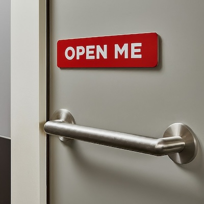
In the physical world, we don’t label emergency exits or doors to public restrooms “Open Me” or “Enter Here.” That would be silly, and there are government regulations against doing so. Why should digital spaces be different?
“Click here” excludes people
Not everyone uses a mouse. Many people browse the web with their keyboard, their voice, screen readers, and other assistive technologies like switches, eye trackers, and sip and puff devices. Lots of us do not have the ability to “click” here.
Furthermore, over 96% of people access the internet with a mobile device according to Forbes. The concept of “clicking” is totally irrelevant on tablets, smartphones, and other devices except in the very rare case when a mouse is connected to them. Tapping is the main way of interacting with links, buttons, and other controls on handheld devices. By saying “click here,” you assume your readers are engaging with your content on a particular platform with specific tools, which most of them are not.
(I have also come across occasional instances of buttons labeled “Tap here.” This is no better.)
“Click here” is cliche and irrelevant
There are numerous overused content marketing terms like “leverage” and “synergy” that are so worn out that they no longer really mean anything. The phrase “click here” should be thrown onto this pile. Any motivational power it may have once held is long gone. It is uncreative and boring, and it shows a lack of thought and care for the message being conveyed and the intended recipient of that message.
We are smart people. After more than 30 years of the Internet, we know what links and buttons are, and we understand how to follow and activate them. Just tell us where they lead, what they do, and why we should care.
Besides frustrating users, “click here” links may also hurt a website’s search engine rankings. One of the metrics that search engines use to rank pages is link relevance, a measurement of how well two pages that connected with links relate to each other. Good link text helps search engines better understand this relationship and boosts the rankings of both pages. Vague and irrelevant link text like “click here” does not.
Write descriptive text for links and buttons
The solution to the “click here” conundrum is simple and straightforward. Write link and button text that clearly communicates the purpose of these elements. The text of the link in the previous sentence clearly indicates the subject of the content you will find at its destination page. You can see that it’s a link because of its specific styling (here underlining and a different text color), and assistive technologies can ascertain that it’s marked up as a link and process it appropriately. You don’t need to be told to “click here.”
Good link text has the following characteristics.
- It is relevant and concise.
- It is contextual within the surrounding copy and flows naturally within it.
- It includes keywords that describe the target content.
For example, if I want to encourage you to sign up for the Pedal Point Solutions mailing list, I don’t give you a click here link, but an invitation that hopefully intrigues you to join our mailing list and get our free guide on high-impact accessibility wins for your website. This link text is clear about its purpose (allow users to subscribe to the list) and its destination (a list sign-up mechanism that will yield a free resource). It is keyword rich and flows with the surrounding text.
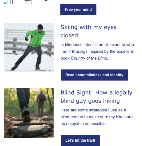
Well-crafted button text shares the same features, with the possible exception of flowing with the adjacent content. Typically, a button serves as a call to action at the end of a set of instructions, block of text, or form. There is a natural stopping point in the content giving the user a chance to shift focus to what should happen next. This next step should be communicated by button text that incorporates these attributes.
- It is succinct (often even more so than link text).
- It contains keywords that describe what the button does.
- It is often an action verb phrase.
For instance, if I want you to read the articles linked in The Pedalpointer newsletter, I don’t say “click here” (or its cousin “read more”) to ask for this. No, I provide clear phrases that will pique your interest to free your mind, read about blindness and identity, and hit the trail.
Conclusion
“Click here” buttons and links are unhelpful, inaccessible, and banal. They cause confusion and erect barriers for our audience, and they water down our message. Let’s avoid them judiciously and instead put in the effort to create vibrant calls to action that resonate with those we want to reach.